Homework 01
TidyTuesday Section
Explore the week’s TidyTuesday challenge. Develop a research question, then answer it through a short data story with effective visualization(s). Provide sufficient background for readers to grasp your narrative.
I will not pretend to have extensive knowledge of the basis of this dataset, or what capital stock actually is. However, I understand that it could be interesting to see how company size relates to how much capital stock a company has. in theory, this should be somewhat proportional; I’d like to investigate.
Code
# A tibble: 3 × 6
  company_size         n median_capital mean_capital    q25     q75
  <chr>            <int>          <dbl>        <dbl>  <dbl>   <dbl>
1 micro-enterprise 66202         300000    21291946. 200000  500000
2 other            42520        1037169   500429583. 460297 3553019
3 small-enterprise 32610         350000   837193374. 205000  700000
Code
# making the plot
plot_pretty <- companies_clean %>%
  ggplot(aes(x = company_size, y = capital_stock, fill = company_size))+
  geom_boxplot(alpha = 0.7, outlier.shape = NA) +
  geom_jitter(alpha = 0.1, width = 0.2, size = 0.5, color = "gray30") + # Kelsey says geom_jitter is better than geom_point and shes right

# Put on a log scale as capital stock varies widely
scale_y_log10(labels = label_number(prefix = "R$", suffix = "", scale = 1, big.mark = ","), breaks = scales::trans_breaks("log10", function(x) 10^x)) +
# Make it an Effective Viz!
 scale_fill_manual(values = c("micro-enterprise" = "green", "small-enterprise" = "yellow", "other" = "darkblue")) +
  labs(title = "Capital Stock by Company Size in Brazil", subtitle = "Declared share capital (BRL) across different enterprise sizes", x = "Company Size ", y = "Capital Stock (BRL)",
    caption = "Visualization: [Olivia Seiler] | #TidyTuesday | Data: TidyTuesday 2026-01-27")

plot_pretty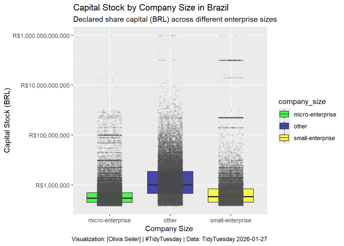
This visualization reveals massive inequality in capital allocation among different enterprise sizes, with values spanning a very large range within each category. This raises important questions about data quality and classification accuracy. Why do some “micro-enterprises” declare capital stock in the billions? Overall, this plot effectively demonstrates that company size categories may not strongly correlate with declared capital stock in Brazil, with substantial overlap across all groups indicating that legal classifications may be outdated or misaligned with economic reality.