---
title: "Undetected and Undertreated"
subtitle: "Racial and Gender Disparities in Hidden Hypoxemia and Their Economic Consequences"
author:
- name: Nayla Trigueros Ortiz
role: Style Lead
- name: Patricia Escobar Contreras
role: Point of Contact
- name: William Acosta Lora
role: Technical Lead
date: today
format:
html:
toc: true
toc-depth: 3
toc-title: "Contents"
theme: cosmo
code-fold: true
code-summary: "Show code"
fig-width: 8
fig-height: 5
execute:
warning: false
message: false
editor:
markdown:
wrap: 72
---
## Motivation
As international students and people of color from different countries
across Latin America, we bring perspectives shaped by healthcare systems
outside the United States. Having navigated both our home countries'
medical institutions and the U.S. system, we have noticed firsthand how
race and skin tone influence the quality of care patients receive, and
how those dynamics shift depending on country and context. Moving to a
predominantly white country has made these disparities more visible to
us, not less. The experience of being a patient — or watching family
members be patients — in systems that were not designed with us in mind
gives this project a personal dimension alongside its academic one.
The project centers on **hidden hypoxemia**, a condition where pulse
oximeters fail to accurately detect low blood oxygen levels in patients
with darker skin tones. We chose this topic because it offers something
rare in health equity research: measurability. The bias is not
anecdotal. It shows up in paired device readings, patient by patient,
and it can be directly quantified. A pulse oximeter clips to your
fingertip and estimates blood oxygen saturation by shining near-infrared
light through the skin. Melanin, the pigment responsible for skin color,
absorbs some of those wavelengths and inflates the reading — causing the
device to report higher oxygen levels than the patient actually has. The
most dangerous consequence is occult hypoxemia: the device reads normal
while the patient is genuinely hypoxic, and clinicians, trusting the
number they see, withhold the oxygen therapy and interventions the
patient needs.
This makes pulse oximeter bias a particularly powerful entry point for
studying health equity. It is not a question of patient behavior or
lifestyle — it is a direct, measurable failure of medical technology,
built into device calibration curves that were historically validated on
lighter-skinned subjects. The downstream consequences — delayed
treatment, longer hospitalizations, higher costs, worse outcomes — fall
disproportionately on communities of color, making this simultaneously a
health equity issue and an economic justice issue. We want to use data
to examine what we have observed anecdotally, and to measure the real
consequences that medical device bias and systemic inequity have on
patients of color in U.S. hospital settings.
## Research Questions
Our analysis is organized around three core questions:
1. **How does pulse oximetry accuracy vary across skin tone, race, and
sex, and what is the magnitude of hidden hypoxemia disparities?** We
examine both the raw measurement bias and the rate of clinically
significant misdiagnosis by Fitzpatrick skin tone group and by
self-reported race and ethnicity.
2. **What are the economic consequences of respiratory misdiagnosis and
delayed treatment for patients of color in hospital settings?** We
connect the clinical disparity to its downstream economic burden
using hospital discharge data, examining charges, costs, and length
of stay stratified by race.
3. **Do race, sex, and insurance status intersect to compound economic
disparities in respiratory care?** We examine whether the
disparities in misdiagnosis and cost are uniform across demographic
groups or whether certain intersecting identities — such as Black
women, or uninsured Hispanic/Latino patients — face compounded
disadvantages.
The ideas we most want to communicate are: that pulse oximeter bias is
real and measurable; that it follows a racial and skin-tone gradient;
that the downstream economic consequences mirror that same gradient; and
that even after controlling for age, insurance, and illness severity, a
residual charge gap persists that is consistent with a pre-admission
clinical failure upstream of the hospital.
## Background
### Key Terms
**Pulse oximeter (SpO₂):** A non-invasive device that clips to the
fingertip and estimates blood oxygen saturation using light absorption.
The reading is expressed as a percentage and labeled SpO₂.
**Arterial blood gas (SaO₂):** The gold-standard measurement of true
blood oxygen saturation, obtained via a needle draw from an artery and
analyzed in a laboratory. SaO₂ is slower and more invasive than pulse
oximetry but is not subject to melanin interference.
**Bias:** The difference between a device's reading and the true value
(SpO₂ − SaO₂). Positive bias means the device overestimates — it reports
a higher oxygen level than the patient actually has.
**Occult hypoxemia:** The clinical event where SpO₂ is at or above 88%
(the device reads "normal") while SaO₂ is below 88% (the patient is
genuinely hypoxic). This is the specific failure mode that causes
clinicians to withhold treatment.
**Fitzpatrick scale:** A six-point scale (I = lightest, VI = darkest)
used to classify human skin tone based on its response to UV exposure.
Used in the OpenOximetry dataset as an objective, observer-measured skin
tone score.
**APR severity of illness:** The All Patients Refined (APR) Diagnosis
Related Group severity score, coded on a 1–4 scale (Minor, Moderate,
Major, Extreme) from hospital discharge records. It summarizes the
clinical complexity of an admission.
**CCSR codes:** Clinical Classifications Software Refined codes, a
standardized system for grouping ICD-10 diagnosis codes. All respiratory
diagnoses share the prefix RSP.
**Ecological association:** A statistical relationship observed at the
group level (e.g., racial groups) rather than at the individual patient
level. Our bridge analysis produces ecological associations — not
patient-level causal estimates.
### Why 88%?
The 88% SpO₂ threshold is a standard clinical decision point. Patients
with SpO₂ readings below 88% are typically eligible for supplemental
oxygen, certain medications, and in some cases specific therapeutic
interventions. Patients at or above 88% may be discharged or have
treatment withheld. A device that reports SpO₂ ≥ 88% when true SaO₂ is
below 88% therefore shifts a patient across a consequential clinical
threshold — from eligible for treatment to ineligible — on the basis of
a measurement error.
## Data
### OpenOximetry Dataset
```{r}
#| label: load-oximetry
#| message: false
#| warning: false
library(tidyverse)
library(scales)
library(patchwork)
library(ggrepel)
library(gtsummary)
library(DataExplorer)

theme_set(theme_minimal(base_size = 13))

# Skin tone palette used throughout
skin_pal <- c(
  "Light (I–II)"    = "#E8C97A",
  "Medium (III–IV)" = "#B06840",
  "Dark (V–VI)"     = "#4A1E0E"
)

# Base theme
theme_eda <- function() {
  theme_minimal(base_size = 13) +
  theme(
    plot.title       = element_text(size = 14, face = "bold", margin = margin(b = 4)),
    plot.subtitle    = element_text(size = 11, color = "gray"),
    plot.caption     = element_text(size = 9,  color = "darkgray"),
    axis.title       = element_text(size = 11, color = "darkgray"),
    axis.text        = element_text(size = 10, color = "darkgray"),
    panel.grid.major.x = element_blank(),
    panel.grid.minor   = element_blank(),
    strip.text       = element_text(size = 11, face = "bold", color = "darkgray")
  )
}

patients      <- read_csv("data/raw/patient.csv")
encounter     <- read_csv("data/raw/encounter.csv")
pulseoximeter <- read_csv("data/raw/pulseoximeter.csv")
bloodgas      <- read_csv("data/raw/bloodgas.csv")

oximetry <- pulseoximeter |>
  inner_join(
    bloodgas |> select(encounter_id, sample, so2),
    by = c("encounter_id", "sample_number" = "sample")
  ) |>
  rename(SpO2 = saturation, SaO2 = so2) |>
  left_join(
    encounter |> select(encounter_id, patient_id, fitzpatrick, age_at_encounter),
    by = "encounter_id"
  ) |>
  left_join(
    patients |> select(patient_id, race, ethnicity, assigned_sex),
    by = "patient_id"
  ) |>
  mutate(
    bias             = SpO2 - SaO2,
    occult_hypoxemia = SpO2 >= 88 & SaO2 < 88,
    skin_group = cut(
      fitzpatrick,
      breaks = c(0, 2, 4, 6),
      labels = c("Light (I–II)", "Medium (III–IV)", "Dark (V–VI)"),
      include.lowest = TRUE
    ),
    race_eth = case_when(
      ethnicity == "Hispanic"                                    ~ "Hispanic/Latino",
      str_detect(race, "African American") & ethnicity == "Not Hispanic" ~ "Black",
      race == "Caucasian"                  & ethnicity == "Not Hispanic" ~ "White",
      str_detect(race, "^Asian")           & ethnicity == "Not Hispanic" ~ "Asian",
      TRUE                                                       ~ NA_character_
    ),
    device_label = paste0("Model ", as.integer(floor(device)))
  ) |>
  filter(!is.na(race_eth)) |>
  filter(is.finite(bias), is.finite(SpO2), is.finite(SaO2))

oximetry |>
  distinct(patient_id, .keep_all = TRUE) |>
  select(race_eth, age_at_encounter, fitzpatrick, skin_group) |>
  tbl_summary(
    label = list(
      race_eth           ~ "Race / Ethnicity",
      age_at_encounter   ~ "Age at encounter (years)",
      fitzpatrick        ~ "Fitzpatrick score (1–6)",
      skin_group         ~ "Skin tone group"
    ),
    statistic = list(
      all_continuous()  ~ "{mean} ({sd})",
      all_categorical() ~ "{n} ({p}%)"
    ),
    missing = "ifany"
  ) |>
  bold_labels() |>
  modify_caption("**Table 1. Patient demographics — OpenOximetry (unique patients)**")
```
The **OpenOximetry dataset** was collected prospectively by the UCSF
Hypoxia Lab as part of the OpenOximetry Project. Participants were
recruited from volunteers in the San Francisco Bay Area and exposed to
controlled hypoxic conditions in a laboratory setting. Researchers
simultaneously measured blood oxygen saturation using multiple
commercially available pulse oximeter devices and an indwelling arterial
catheter, providing a ground-truth SaO₂ reading for each device reading
at each moment in time. Skin tone was measured objectively using a
spectrophotometer at multiple body sites and converted to both
Fitzpatrick and Monk scale scores by trained staff. Patients
self-reported race and ethnicity. The dataset is stored as five
relational CSVs and accessed through a Data Use Agreement on the
PhysioNet platform. The version used here is OpenOximetry 1.1.1,
released in 2023.
After joining all five tables and removing non-finite bias values from
unmatched rows, the merged dataset contains
**`r nrow(oximetry) |> comma()` paired measurements** across
**`r n_distinct(oximetry$patient_id)` unique patients** and
**`r n_distinct(oximetry$encounter_id)` encounters**. Each row
represents one device reading matched to one arterial blood gas
measurement. Because multiple devices are read simultaneously on the
same patient at the same moment, a single blood draw generates multiple
rows — one per device. This structure is deliberate: it enables
within-encounter comparisons that hold patient physiology constant and
isolate device effects.
The key derived variables are `bias` (SpO₂ − SaO₂, positive =
overestimate) and `occult_hypoxemia` (logical: SpO₂ ≥ 88% while SaO₂ \<
88%). The primary skin tone variable is `fitzpatrick`, grouped into
three bands for visualization: Light (I–II), Medium (III–IV), and Dark
(V–VI).
### NY SPARCS Dataset
```{r}
#| label: load-sparcs
#| message: false
#| warning: false
sparcs_raw <- read_csv(
  "https://health.data.ny.gov/resource/tg3i-cinn.csv?$where=ccsr_diagnosis_code%20like%20%27RSP%25%27&$limit=500000",
  show_col_types = FALSE
)

sparcs <- sparcs_raw |>
  filter(str_starts(ccsr_diagnosis_code, "RSP")) |>
  mutate(
    length_of_stay = as.numeric(length_of_stay),
    total_charges  = as.numeric(total_charges),
    total_costs    = as.numeric(total_costs),
    race_eth = case_when(
      ethnicity == "Spanish/Hispanic"                              ~ "Hispanic/Latino",
      race == "Black/African American" & ethnicity == "Not Span/Hispanic" ~ "Black",
      race == "White"                  & ethnicity == "Not Span/Hispanic" ~ "White",
      TRUE                                                         ~ NA_character_
    ),
    age_group = case_when(
      age_group %in% c("18 to 29", "30 to 49") ~ "18–49",
      age_group == "50 to 69"                  ~ "50–69",
      age_group == "70 or Older"               ~ "70+",
      TRUE                                     ~ NA_character_
    ),
    insurance = case_when(
      str_detect(payment_typology_1, regex("medicaid", ignore_case = TRUE)) ~ "Medicaid",
      str_detect(payment_typology_1, regex("medicare", ignore_case = TRUE)) ~ "Medicare",
      str_detect(payment_typology_1, regex("private",  ignore_case = TRUE)) ~ "Private",
      str_detect(payment_typology_1, regex("self",     ignore_case = TRUE)) ~ "Self-Pay",
      TRUE                                                                   ~ "Other"
    ),
    severity = factor(
      apr_severity_of_illness,
      levels = c("Minor", "Moderate", "Major", "Extreme")
    ),
    severity_code      = apr_severity_of_illness_code,
    risk_of_mortality  = factor(
      apr_risk_of_mortality,
      levels = c("Minor", "Moderate", "Major", "Extreme")
    ),
    died = str_detect(patient_disposition, regex("expired|died", ignore_case = TRUE))
  ) |>
  filter(!is.na(race_eth))

sparcs |>
  select(gender, race_eth, age_group, insurance, severity,
         length_of_stay, total_charges, total_costs) |>
  tbl_summary(
    label = list(
      gender         ~ "Gender",
      race_eth       ~ "Race / Ethnicity",
      age_group      ~ "Age group",
      insurance      ~ "Insurance type",
      severity       ~ "Illness severity",
      length_of_stay ~ "Length of stay (days)",
      total_charges  ~ "Total charges ($)",
      total_costs    ~ "Total costs ($)"
    ),
    statistic = list(
      all_continuous()  ~ "{median} ({p25}, {p75})",
      all_categorical() ~ "{n} ({p}%)"
    ),
    missing = "ifany"
  ) |>
  bold_labels() |>
  modify_caption("**Table 2. Patient characteristics — SPARCS respiratory discharges**")
```
The **NY SPARCS dataset** (Statewide Planning and Research Cooperative
System) is a mandatory hospital discharge reporting system administered
by the New York State Department of Health. All hospitals operating in
New York State are required to submit a discharge record for every
inpatient stay. The 2021 de-identified file is freely available through
the NY Health Data open portal with no login required. It contains over
2 million discharge records statewide; we filter server-side to
respiratory diagnoses (CCSR codes beginning with RSP) and pull 103,907
records via the public API — no file is saved to disk.
SPARCS is administrative data, collected primarily for billing and
regulatory purposes rather than research. This matters for
interpretation: the APR severity score is assigned by coders working
from the discharge record after the fact, not by clinicians at the
bedside. Race and ethnicity are recorded using a combination of
self-report and administrative assignment. Hispanic patients appear
under multiple race codes in SPARCS, requiring an ethnicity-first recode
strategy: patients coded as Spanish/Hispanic ethnicity are classified as
Hispanic/Latino regardless of their race field. This captures the full
Hispanic/Latino population, which would otherwise be substantially
undercounted.
After filtering and recoding, the dataset contains
**`r nrow(sparcs) |> comma()` discharge records** across three focal
racial groups. Key variables include total charges, total costs, length
of stay, APR severity of illness (1–4), APR risk of mortality (1–4),
insurance type, and a derived binary mortality indicator from the
patient disposition field.
### Connection Between the Two Datasets
The two datasets do not share patients. OpenOximetry is a San Francisco
Bay Area laboratory population; SPARCS is a New York State hospital
discharge population. We connect them at the **group level** by
computing race-stratified summary statistics from each dataset and
joining on race. This produces an ecological bridge: if the racial
gradient in occult hypoxemia from OpenOximetry is consistent with the
racial gradient in charges and severity from SPARCS, that consistency is
evidence — though not proof — that the clinical disparity translates
into downstream economic burden.
------------------------------------------------------------------------
## Data Insights
### Part 1: The Clinical Disparity — Who Gets Misdiagnosed?
### SpO₂, SaO₂, and Bias Distributions
```{r fig.width=10}
#| label: spo2-sao2
#| fig-alt: "Overlapping density plots of SpO2 and SaO2"
oximetry |>
  select(SpO2, SaO2) |>
  pivot_longer(everything(), names_to = "measure", values_to = "value") |>
  ggplot(aes(x = value, fill = measure)) +
  geom_density(alpha = 0.45) +
  scale_fill_manual(values = c("SaO2" = "#2171b5", "SpO2" = "#ef6548")) +
  geom_vline(xintercept = 88, linetype = "dashed", color = "grey40") +
  annotate("text", x = 87.3, y = 0.15, label = "88% threshold",
           hjust = 1, size = 3.5, color = "grey40") +
  labs(
    title = "SpO₂ (pulse ox) vs. SaO₂ (arterial blood gas)",
    x = "Oxygen saturation (%)", y = "Density", fill = "Measurement"
  )
```
```{r}
#| label: bias-dist
#| fig-alt: "Density plot of pulse oximeter bias capped at plus or minus 20pp"
bias_mean <- mean(oximetry$bias, na.rm = TRUE)

oximetry |>
  filter(between(bias, -20, 20)) |>
  ggplot(aes(x = bias)) +
  geom_density(fill = "#9ecae1", alpha = 0.7) +
  geom_vline(xintercept = 0,         linetype = "solid",  color = "grey30") +
  geom_vline(xintercept = bias_mean, linetype = "dashed", color = "#e34a33") +
  annotate("text", x = bias_mean + 0.3, y = Inf, vjust = 1.5,
           label = paste0("Mean = ", round(bias_mean, 2), " pp"),
           color = "#e34a33", size = 3.8) +
  labs(
    title    = "Distribution of pulse oximeter bias (SpO₂ − SaO₂)",
    subtitle = "Positive = device overestimates true oxygen saturation; capped at ±20 pp for readability",
    x = "Bias (pp)", y = "Density"
  )
```
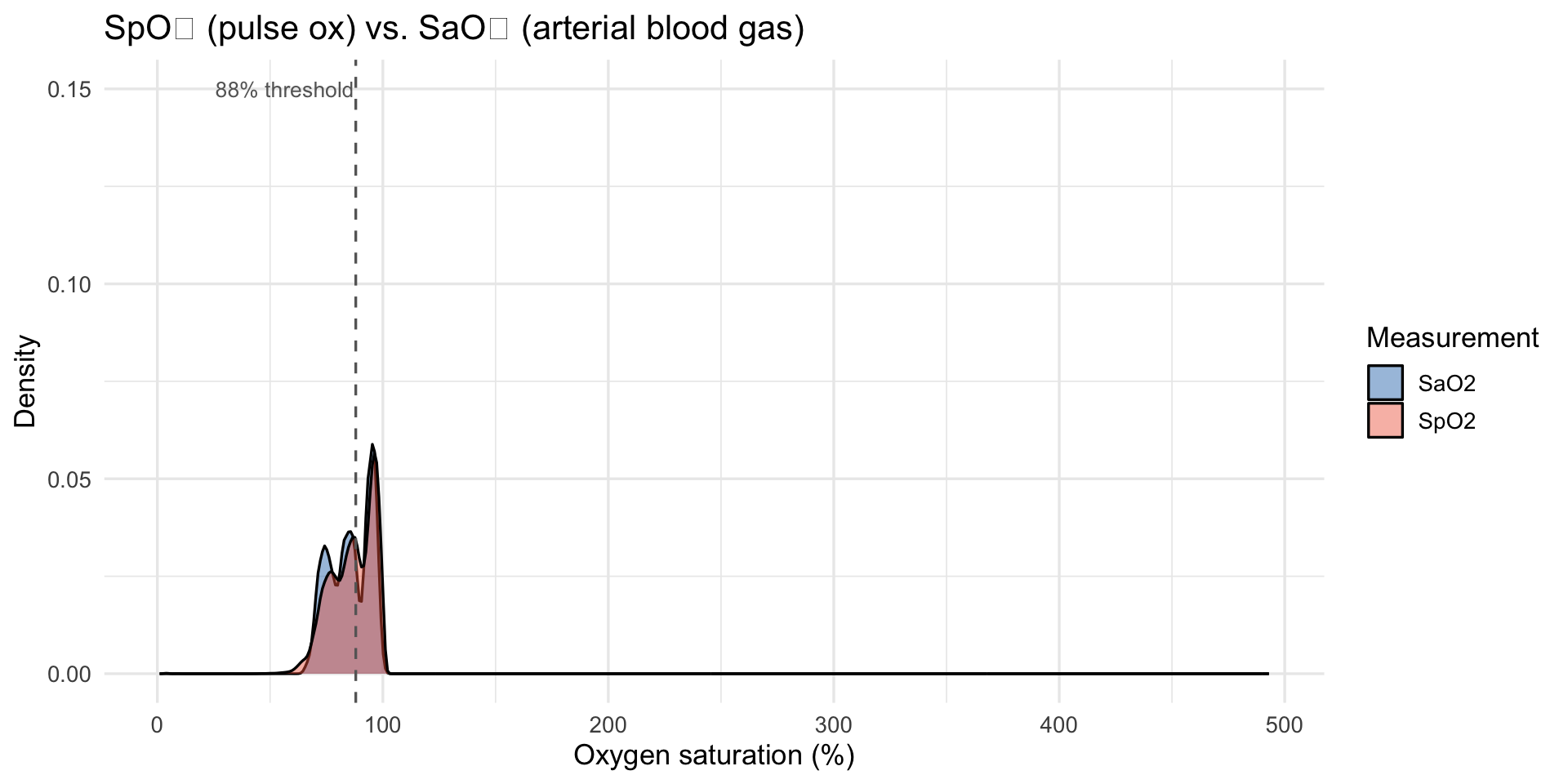
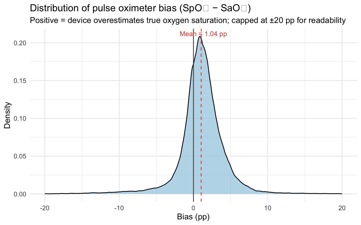
The mean bias of `r round(bias_mean, 2)` percentage points means the
pulse oximeter reports oxygen saturation about one point higher than the
patient actually has on average. That sounds small, but clinical
decisions, whether to administer supplemental oxygen, whether a patient
is stable for discharge — are often made on differences of one or two
points. A device that consistently flatters the reading shifts those
decision thresholds in ways that disadvantage every patient, but
disadvantage darker-skinned patients most.
```{r}
#| label: bias-skin
#| fig-alt: "Violin and boxplot of bias by Fitzpatrick skin tone group"
oximetry |>
  filter(!is.na(skin_group), between(bias, -20, 20)) |>
  ggplot(aes(x = skin_group, y = bias, fill = skin_group)) +
  geom_violin(alpha = 0.5, trim = TRUE) +
  geom_boxplot(width = 0.15, outlier.shape = NA, alpha = 0.8) +
  geom_hline(yintercept = 0, linetype = "dashed", color = "grey40") +
  scale_fill_manual(values = c("#f5c07a", "#c8855a", "#6b3a2a")) +
  labs(
    title    = "Pulse oximeter bias by Fitzpatrick skin tone group",
    subtitle = "Capped at ±20 pp; shows bulk of distribution",
    x = "Skin tone group", y = "Bias (SpO₂ − SaO₂, pp)"
  ) +
  theme(legend.position = "none")
```
```{r}
#| label: bias-fitzpatrick-scatter
#| message: false
#| fig-alt: "Scatter of bias vs continuous Fitzpatrick score with loess smoother"
oximetry |>
  filter(!is.na(fitzpatrick), between(bias, -20, 20)) |>
  ggplot(aes(x = fitzpatrick, y = bias)) +
  geom_jitter(alpha = 0.15, width = 0.15, color = "#6b3a2a") +
  geom_smooth(method = "loess", se = TRUE, color = "#e34a33", linewidth = 1.2) +
  geom_hline(yintercept = 0, linetype = "dashed", color = "grey40") +
  scale_x_continuous(breaks = 1:6) +
  labs(
    title    = "Pulse oximeter bias vs. continuous Fitzpatrick score",
    subtitle = "Bias increases continuously with darker skin tone; capped at ±20 pp",
    x = "Fitzpatrick score (1 = lightest, 6 = darkest)", y = "Bias (pp)"
  )
```
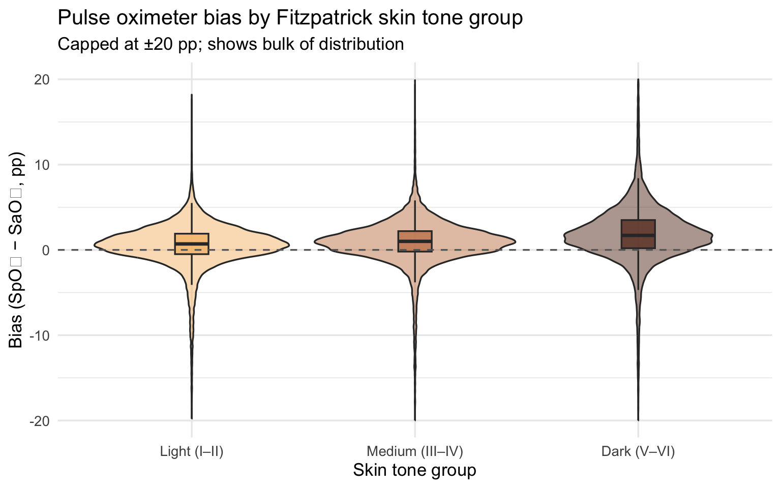
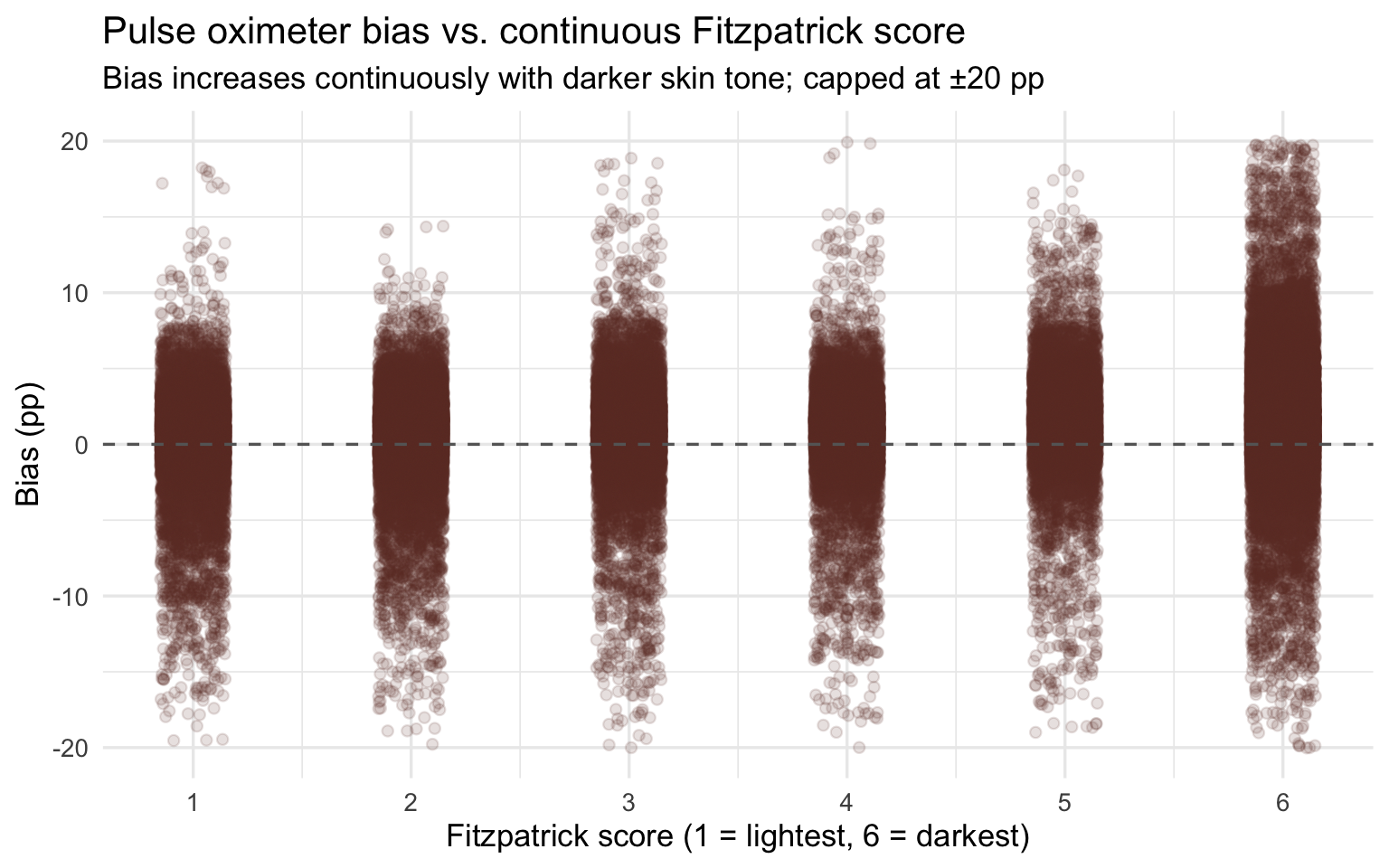
Bias magnitude matters because it determines whether a patient crosses
the clinical threshold for treatment. The most consequential form of
error is **occult hypoxemia**: the device reads SpO₂ ≥ 88% (appearing
normal) while true SaO₂ is below 88% (the patient is genuinely hypoxic).
This is not a measurement nuisance — it is the specific failure mode
that causes clinicians to withhold oxygen therapy and delay intervention
from patients who need it.
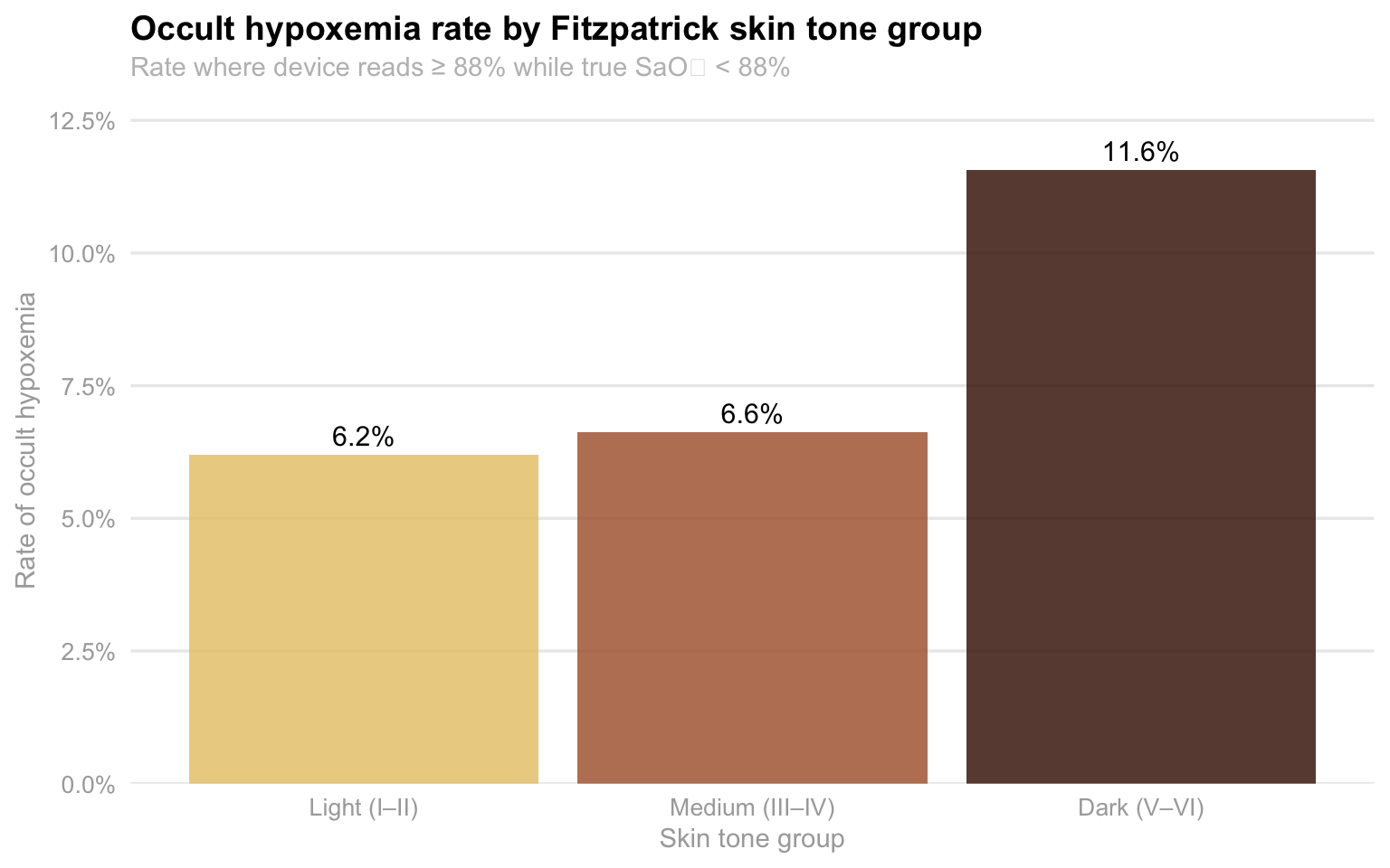
#### The occult hypoxemia rate nearly doubles from lightest to darkest skin tone
```{r}
#| label: occult-skin
#| fig-alt: "Bar chart of occult hypoxemia rate by Fitzpatrick skin tone group"
oximetry |>
  filter(!is.na(skin_group)) |>
  group_by(skin_group) |>
  summarise(
    n        = n(),
    n_occult = sum(occult_hypoxemia, na.rm = TRUE),
    rate     = n_occult / n
  ) |>
  ggplot(aes(x = skin_group, y = rate, fill = skin_group)) +
  geom_col(alpha = 0.85) +
  geom_text(aes(label = percent(rate, accuracy = 0.1)), vjust = -0.5, size = 4) +
  scale_y_continuous(labels = percent_format(), expand = expansion(mult = c(0, 0.12))) +
  scale_fill_manual(values = skin_pal) +
  labs(
    title    = "Occult hypoxemia rate by Fitzpatrick skin tone group",
    subtitle = "Rate where device reads ≥ 88% while true SaO₂ < 88%",
    x = "Skin tone group", y = "Rate of occult hypoxemia"
  ) +
  theme_eda() +
  theme(legend.position = "none")
```
Among patients with Dark (V–VI) skin tones, 11.6% of measurements result
in occult hypoxemia — the device reports normal while the patient is
genuinely hypoxic. For Light (I–II) skin tones, the rate is 6.2%. This
is not a difference in how sick the patients actually are: the arterial
blood gas tells us the truth, and both groups are equally hypoxic in
those moments. The difference is entirely in what the device reports.
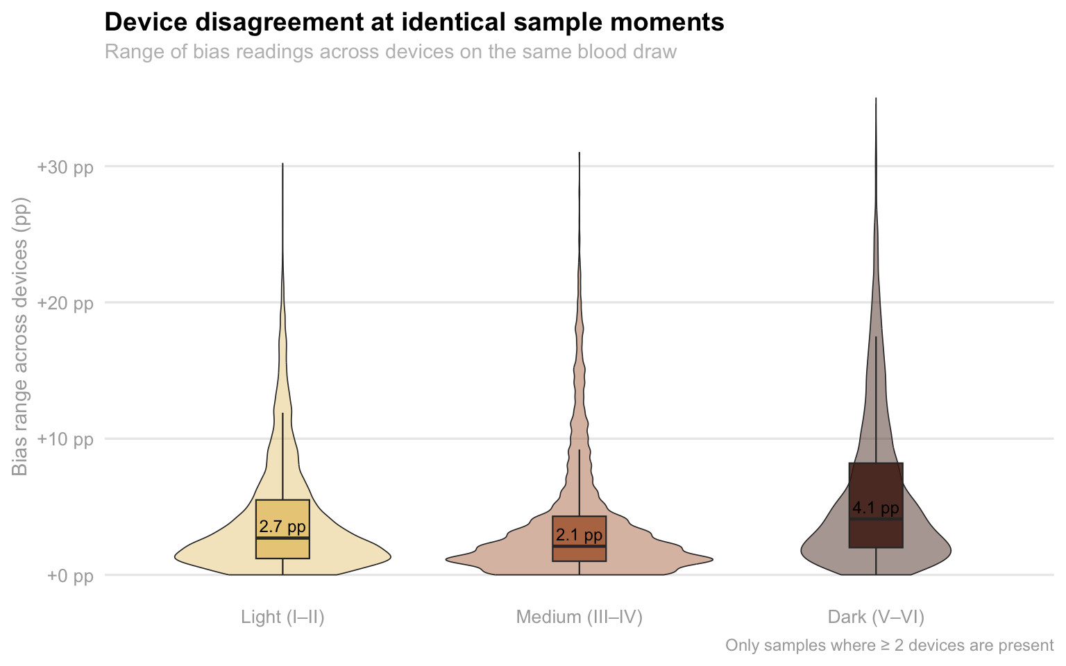
#### Device disagreement is worst for darker-skinned patients
```{r}
#| label: device-spread
#| fig-alt: "Violin and boxplot of within-sample device disagreement by skin tone group"
top_brands <- oximetry |>
  count(device) |>
  filter(n >= 500) |>
  pull(device)

oximetry_top <- oximetry |>
  filter(device %in% top_brands) |>
  mutate(device_label = paste0("Model ", as.integer(floor(device))),
         device_label = fct_reorder(device_label, as.integer(floor(device))))

device_spread <- oximetry_top |>
  filter(between(bias, -20, 20), !is.na(skin_group)) |>
  group_by(encounter_id, sample_number, skin_group) |>
  summarise(
    bias_range = max(bias) - min(bias),
    n_devices  = n_distinct(device),
    .groups    = "drop"
  ) |>
  filter(n_devices >= 2)

device_spread |>
  ggplot(aes(x = skin_group, y = bias_range, fill = skin_group)) +
  geom_violin(alpha = 0.45, trim = TRUE, linewidth = 0.3) +
  geom_boxplot(width = 0.18, outlier.shape = NA, alpha = 0.85, linewidth = 0.4) +
  stat_summary(
    fun = median, geom = "text",
    aes(label = sprintf("%.1f pp", after_stat(y))),
    vjust = -0.5, size = 3.2, color = "black"
  ) +
  scale_fill_manual(values = skin_pal) +
  scale_y_continuous(labels = function(x) sprintf("%+.0f pp", x), limits = c(0, NA)) +
  labs(
    title    = "Device disagreement at identical sample moments",
    subtitle = "Range of bias readings across devices on the same blood draw",
    x = NULL, y = "Bias range across devices (pp)",
    caption  = "Only samples where ≥ 2 devices are present"
  ) +
  theme_eda() +
  theme(legend.position = "none")
```
This plot shows a within-encounter, controlled comparison: the same
patient, the same blood draw, multiple devices reading simultaneously.
Any disagreement between devices on the same sample is a pure device
effect — patient physiology is held constant. The median disagreement
for Dark skin tones is 4.1 pp, compared to 3.0 pp for Light and 2.1 pp
for Medium. More importantly, the upper tail for Dark skin extends
significantly further — two devices measuring the same dark-skinned
patient can differ by more than 30 pp at the same moment. This level of
within-patient variability creates dangerous clinical uncertainty: a
clinician checking a patient twice with two different devices might get
readings that imply very different treatment decisions.
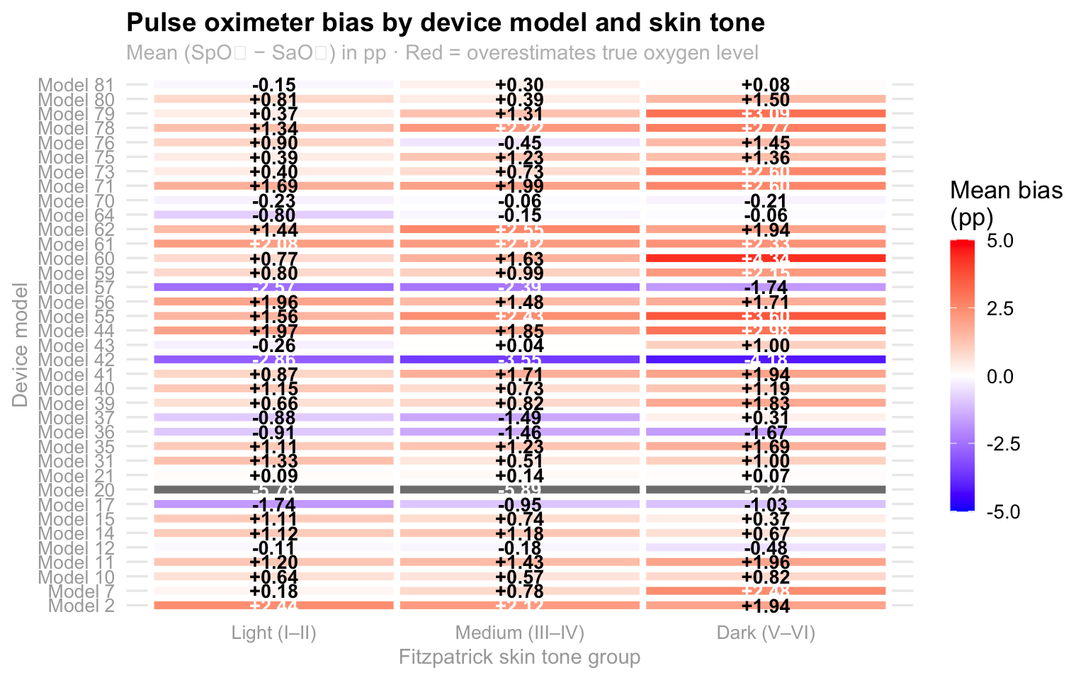
#### The bias is consistent across device models — not driven by one outlier
```{r}
#| label: device-heatmap
#| fig-alt: "Heatmap of mean pulse oximeter bias by device model and skin tone group"
device_skin_summary <- oximetry_top |>
  filter(!is.na(skin_group), between(bias, -20, 20)) |>
  group_by(device_label, skin_group) |>
  summarise(mean_bias = mean(bias, na.rm = TRUE), n = n(), .groups = "drop")

device_skin_summary |>
  ggplot(aes(x = skin_group, y = device_label, fill = mean_bias)) +
  geom_tile(color = "white", linewidth = 1.6) +
  geom_text(
    aes(label = sprintf("%+.2f", mean_bias),
        color = abs(mean_bias) > 2),
    size = 3.6, fontface = "bold", show.legend = FALSE
  ) +
  scale_color_manual(values = c("TRUE" = "white", "FALSE" = "black")) +
  scale_fill_gradient2(
    low = "blue", mid = "white", high = "red", midpoint = 0,
    limits = c(-5, 5), name = "Mean bias\n(pp)",
    guide = guide_colorbar(barwidth = 0.9, barheight = 10, title.position = "top")
  ) +
  labs(
    title    = "Pulse oximeter bias by device model and skin tone",
    subtitle = "Mean (SpO₂ − SaO₂) in pp · Red = overestimates true oxygen level",
    x = "Fitzpatrick skin tone group", y = "Device model"
  ) +
  theme_eda()
```
The heatmap reveals that the overestimation bias for Dark skin tones is
not driven by a single faulty device — it is present across the majority
of models. Most cells in the Dark column trend orange or red, while
cells in the Light column are closer to neutral. This is a systemic
calibration failure shared across commercially available devices, not a
quality control problem with one manufacturer. The implication is that
switching devices would not solve the problem for darker-skinned
patients.
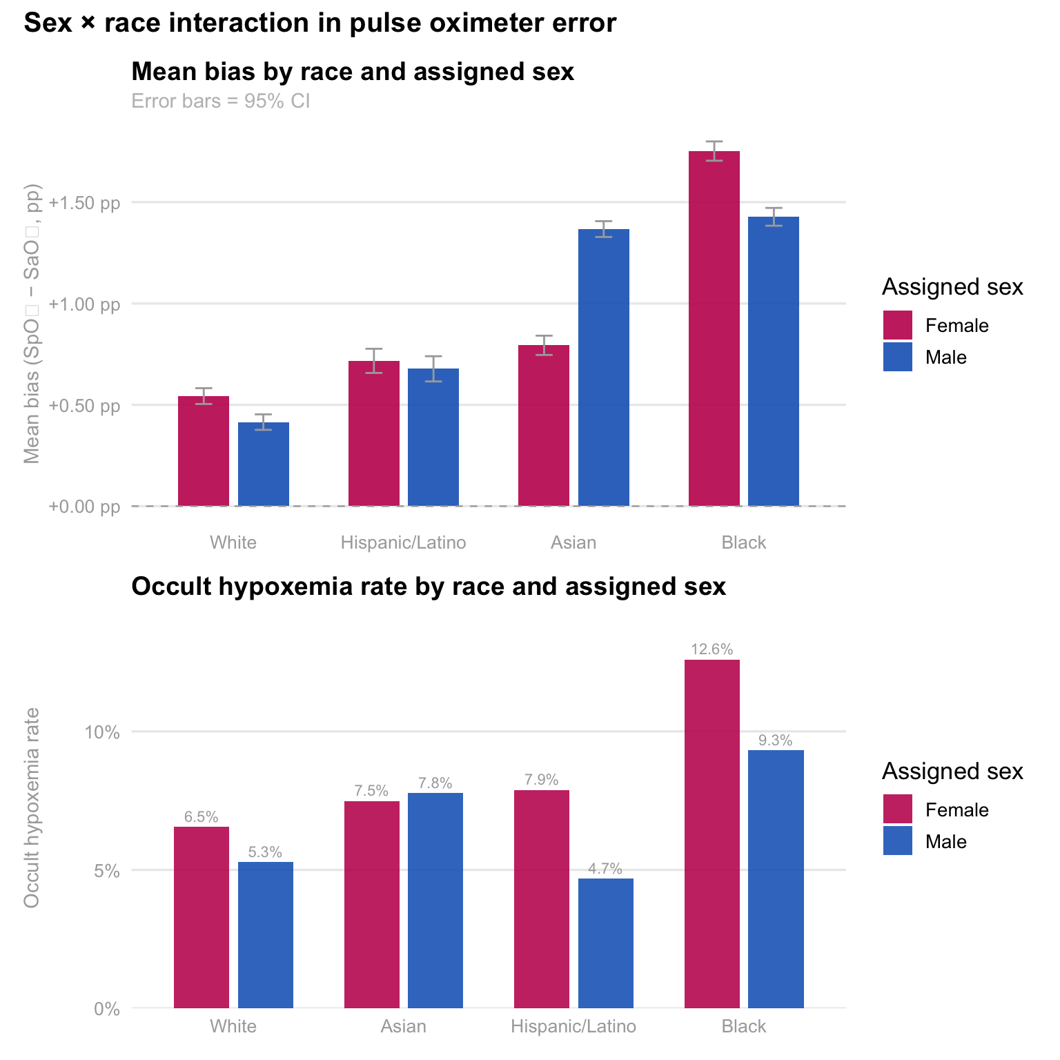
#### Sex compounds the racial disparity — Black women face the highest occult hypoxemia rate
```{r}
#| label: sex-race-plots
#| fig-height: 8
#| fig-alt: "Grouped bar charts of mean bias and occult hypoxemia rate by race and sex"
sex_race <- oximetry |>
  filter(
    !is.na(race_eth), !is.na(assigned_sex),
    assigned_sex %in% c("Female", "Male"),
    between(bias, -20, 20)
  ) |>
  group_by(race_eth, assigned_sex) |>
  summarise(
    mean_bias = mean(bias, na.rm = TRUE),
    se_bias   = sd(bias, na.rm = TRUE) / sqrt(n()),
    oh_rate   = mean(occult_hypoxemia, na.rm = TRUE),
    n         = n(),
    .groups   = "drop"
  ) |>
  filter(n >= 20)

sex_pal <- c("Female" = "#C2185B", "Male" = "#1565C0")

p_sex_bias <- sex_race |>
  mutate(race_eth = fct_reorder(race_eth, mean_bias, max)) |>
  ggplot(aes(x = race_eth, y = mean_bias, fill = assigned_sex)) +
  geom_col(position = position_dodge(width = 0.70), width = 0.60, alpha = 0.90) +
  geom_errorbar(
    aes(ymin = mean_bias - 2 * se_bias, ymax = mean_bias + 2 * se_bias),
    position = position_dodge(width = 0.70), width = 0.20, linewidth = 0.5, color = "darkgray"
  ) +
  geom_hline(yintercept = 0, linetype = "dashed", color = "darkgray", linewidth = 0.4) +
  scale_fill_manual(values = sex_pal, name = "Assigned sex") +
  scale_y_continuous(labels = function(x) sprintf("%+.2f pp", x)) +
  labs(
    title    = "Mean bias by race and assigned sex",
    subtitle = "Error bars = 95% CI",
    x = NULL, y = "Mean bias (SpO₂ − SaO₂, pp)"
  ) +
  theme_eda()

p_sex_oh <- sex_race |>
  mutate(race_eth = fct_reorder(race_eth, oh_rate, max)) |>
  ggplot(aes(x = race_eth, y = oh_rate, fill = assigned_sex)) +
  geom_col(position = position_dodge(width = 0.75), width = 0.65, alpha = 0.88) +
  geom_text(
    aes(label = percent(oh_rate, accuracy = 0.1)),
    position = position_dodge(width = 0.75),
    vjust = -0.5, size = 2.9, color = "darkgray"
  ) +
  scale_fill_manual(values = sex_pal, name = "Assigned sex") +
  scale_y_continuous(labels = percent_format(), expand = expansion(mult = c(0, 0.15))) +
  labs(
    title = "Occult hypoxemia rate by race and assigned sex",
    x = NULL, y = "Occult hypoxemia rate"
  ) +
  theme_eda()

(p_sex_bias / p_sex_oh) +
  plot_annotation(
    title = "Sex × race interaction in pulse oximeter error",
    theme = theme(plot.title = element_text(size = 15, face = "bold"))
  )
```
The sex-stratified analysis reveals that being female amplifies the
racial bias gradient, particularly for Black patients. Black females
experience higher mean bias and a 12.6% occult hypoxemia rate — more
than one in eight encounters — compared to 10.0% for Black males. Asian
females also show higher rates than their male counterparts. This
suggests that the device failures are not uniform within racial groups
and that sex is a meaningful moderating variable, not simply a
demographic control. Patricia's analysis is the only one in the team's
EDA to examine this intersection, and the finding motivates the
intersectional regression analysis planned for Milestone 5.
------------------------------------------------------------------------
### Part 2: The Economic Burden — Who Pays More?
```{r}
#| label: severity-los-heatmap
#| fig-height: 6
#| fig-alt: "Heatmap of mean severity score by top diagnosis and race"
top_dx <- sparcs |>
  count(ccsr_diagnosis_description) |>
  slice_max(n, n = 10) |>
  pull(ccsr_diagnosis_description)

sparcs |>
  filter(ccsr_diagnosis_description %in% top_dx, !is.na(severity_code)) |>
  group_by(race_eth, ccsr_diagnosis_description) |>
  summarise(mean_sev = mean(severity_code, na.rm = TRUE), .groups = "drop") |>
  ggplot(aes(x = race_eth, y = ccsr_diagnosis_description, fill = mean_sev)) +
  geom_tile(color = "white") +
  geom_text(aes(label = round(mean_sev, 2)), size = 3.2) +
  scale_fill_distiller(palette = "YlOrRd", direction = 1, limits = c(1, 4)) +
  labs(
    title    = "Mean severity score by race and top 10 respiratory diagnoses",
    subtitle = "Same-row comparisons control for diagnosis-mix differences",
    x = NULL, y = NULL, fill = "Mean severity"
  ) +
  theme(axis.text.y = element_text(size = 9))
```
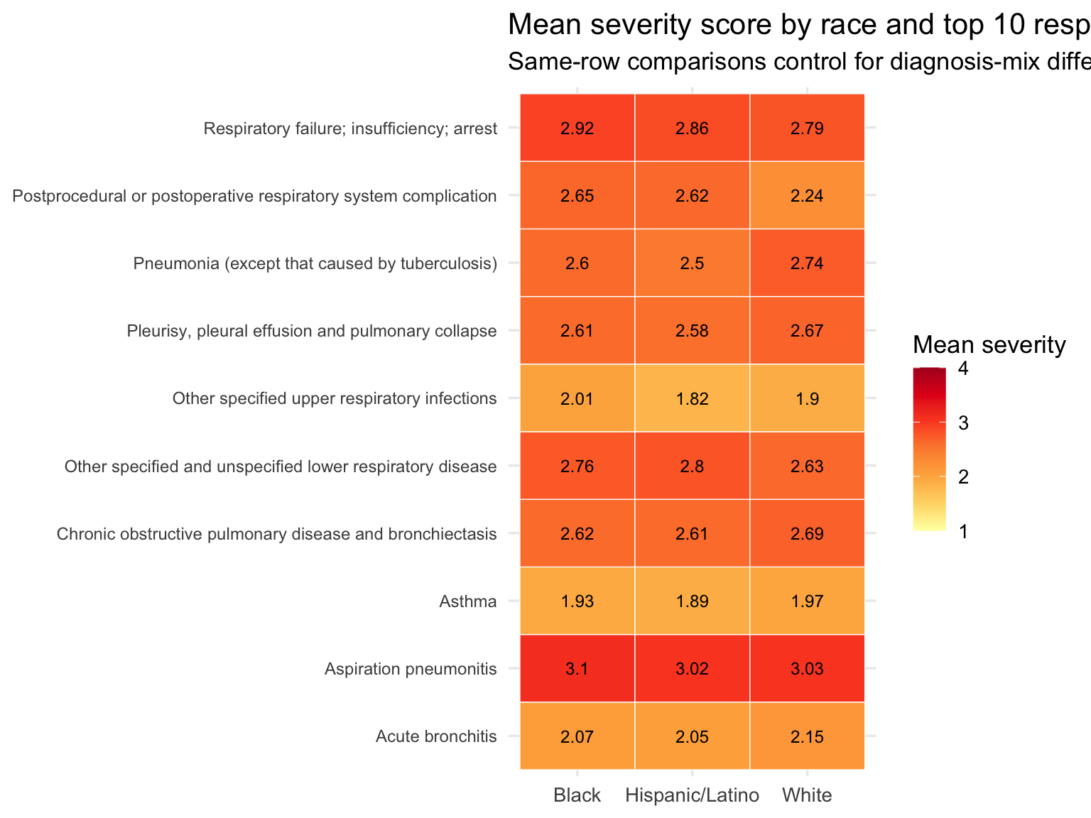
Black patients show a higher share of Major and Extreme severity
discharges than White or Hispanic/Latino patients. The heatmap holds
diagnosis constant — cells in the same row represent the same
respiratory condition — and still shows that Black patients present at
higher severity for most individual diagnoses. This rules out case-mix
as the sole explanation: it is not simply that Black patients are
admitted with different, more severe conditions. They arrive sicker even
for the same diagnoses.
### Race-Level Bridge Table
```{r}
#| label: build-bridge
oximetry_summary <- oximetry |>
  group_by(race_eth) |>
  summarise(
    n_measurements        = n(),
    occult_hypoxemia_rate = mean(occult_hypoxemia, na.rm = TRUE),
    mean_bias             = mean(bias, na.rm = TRUE),
    .groups = "drop"
  )

sparcs_summary <- sparcs |>
  group_by(race_eth) |>
  summarise(
    n_discharges    = n(),
    median_charges  = median(total_charges,  na.rm = TRUE),
    median_costs    = median(total_costs,    na.rm = TRUE),
    median_los      = median(length_of_stay, na.rm = TRUE),
    mean_severity   = mean(severity_code,    na.rm = TRUE),
    mortality_rate  = mean(died,             na.rm = TRUE),
    pct_unprotected = mean(
      insurance %in% c("Medicaid", "Self-Pay"), na.rm = TRUE
    ),
    .groups = "drop"
  )

bridge <- oximetry_summary |>
  inner_join(sparcs_summary, by = "race_eth")


bridge |>
  mutate(
    occult_hypoxemia_rate = percent(occult_hypoxemia_rate, accuracy = 0.1),
    mean_bias             = round(mean_bias, 2),
    median_charges        = dollar(median_charges),
    median_los            = round(median_los, 1),
    mean_severity         = round(mean_severity, 2),
    mortality_rate        = percent(mortality_rate, accuracy = 0.1),
    pct_unprotected       = percent(pct_unprotected, accuracy = 0.1)
  ) |>
  select(race_eth, occult_hypoxemia_rate, mean_bias,
         mean_severity, median_los, median_charges,
         mortality_rate, pct_unprotected) |>
  knitr::kable(
    col.names = c("Race / Ethnicity", "Occult hypoxemia rate",
                  "Mean bias (pp)", "Mean severity", "Median LOS",
                  "Median charges", "Mortality rate", "% Medicaid/Self-Pay"),
    caption = "**Table 3. Race-level bridge: clinical disparity → economic burden**"
  )
# The clearest statement of the connection: the same racial ordering
# that appears in hypoxemia rates also appears in hospital charges
race_order <- bridge |>
  arrange(occult_hypoxemia_rate) |>
  pull(race_eth)
```
This is an **ecological association** across two independent
populations. The table tests whether racial gradients in hypoxemia and
costs are directionally consistent — not whether one causes the other at
the patient level.
The table above shows the race-level bridge at a glance. Reading across
a row gives the full picture for each group: how often they are
misdiagnosed, how biased the device reading is, how sick they are at
admission, how long they stay, what they are billed, and how financially
exposed they are. Reading down a column shows the racial gradient on
each dimension. The question the rest of Part 3 asks is whether those
gradients move together — and whether they survive the most obvious
alternative explanations.
```{r fig.height=10, fig.width=10}
#| label: insurance-stacked-race
#| fig-alt: "Stacked bar showing insurance mix by race ordered by occult hypoxemia rate"
sparcs |>
  filter(!is.na(insurance)) |>
  count(race_eth, insurance) |>
  group_by(race_eth) |>
  mutate(
    pct      = n / sum(n),
    race_eth = factor(race_eth, levels = race_order)
  ) |>
  ungroup() |>
  ggplot(aes(x = race_eth, y = pct, fill = insurance)) +
  geom_col(position = "fill", alpha = 0.85) +
  scale_y_continuous(labels = percent_format()) +
  scale_fill_brewer(palette = "Set2") +
  labs(
    title    = "Insurance type by race — ordered by occult hypoxemia risk (low -> high)",
    subtitle = "Groups most at risk of hidden hypoxemia have the least financial protection",
    x = NULL, y = "Proportion of discharges", fill = "Insurance"
  )
```
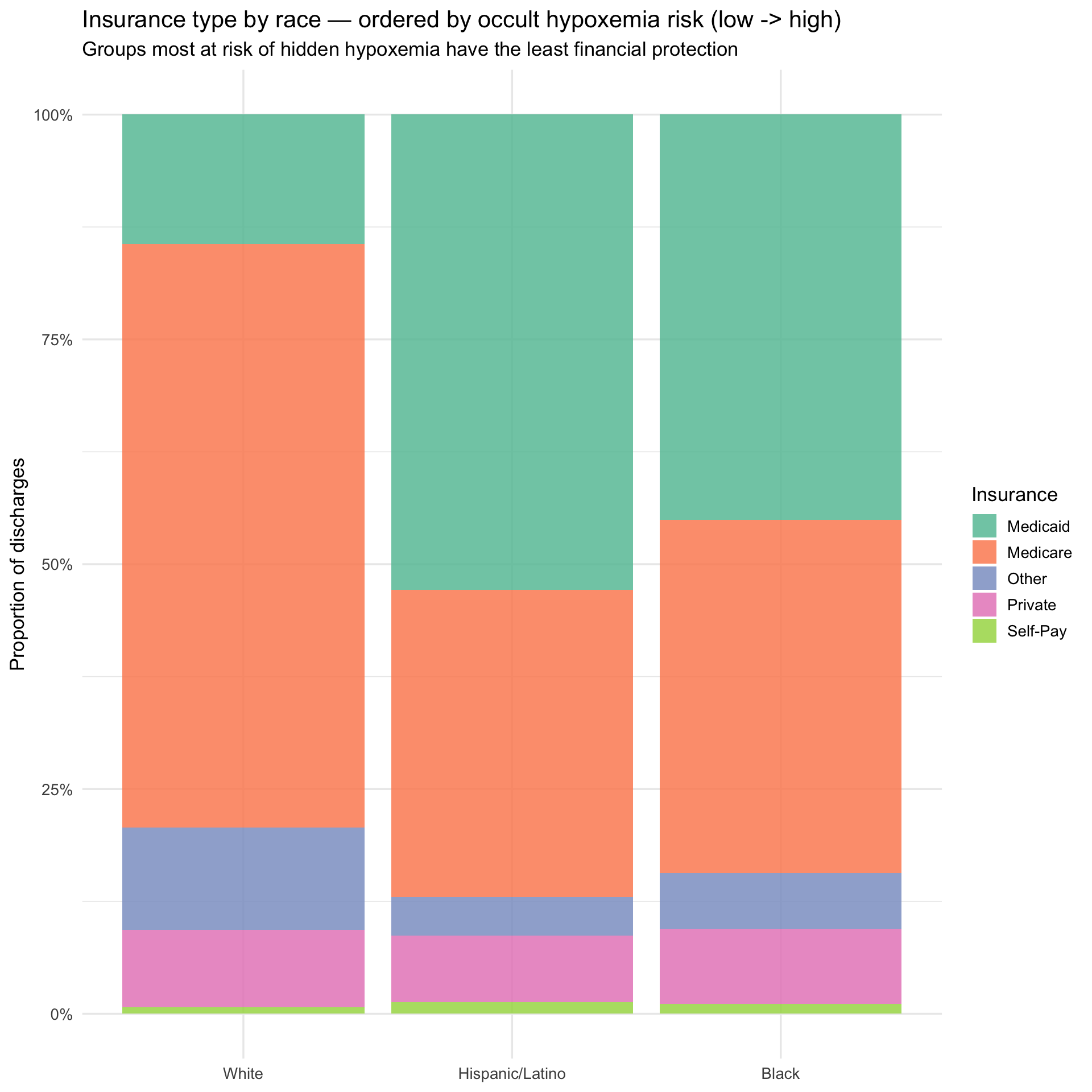
The insurance breakdown, ordered from lowest to highest occult hypoxemia
risk left to right, illustrates the compounding structure of the
problem. Moving from White to Hispanic/Latino to Black, Medicaid share
rises and Medicare share falls — meaning the groups most likely to be
misdiagnosed are also the groups with the least financial cushion when
that misdiagnosis leads to a more expensive hospitalization. The next
plot asks whether the misdiagnosis gradient and the cost gradient point
in the same direction.
### Hypoxemia Charges Side by Side
```{r fig.width=10}
#| label: hypoxemia-charges-sidebyside
#| fig-alt: "Side by side bar charts showing occult hypoxemia rate and median charges by race"
p_hyp <- bridge |>
  mutate(race_eth = factor(race_eth, levels = race_order)) |>
  ggplot(aes(x = race_eth, y = occult_hypoxemia_rate, fill = race_eth)) +
  geom_col(alpha = 0.85, show.legend = FALSE) +
  geom_text(aes(label = percent(occult_hypoxemia_rate, accuracy = 0.1)),
            vjust = -0.4, size = 4) +
  scale_y_continuous(labels = percent_format(),
                     expand  = expansion(mult = c(0, 0.15))) +
  scale_fill_brewer(palette = "Set1") +
  labs(
    title    = "Occult hypoxemia rate by race",
    subtitle = "OpenOximetry — who gets misdiagnosed",
    x = NULL, y = "Occult hypoxemia rate"
  )

p_charges <- bridge |>
  mutate(race_eth = factor(race_eth, levels = race_order)) |>
  ggplot(aes(x = race_eth, y = median_charges, fill = race_eth)) +
  geom_col(alpha = 0.85, show.legend = FALSE) +
  geom_text(aes(label = dollar(median_charges, accuracy = 1)),
            vjust = -0.4, size = 4) +
  scale_y_continuous(labels = dollar_format(),
                     expand  = expansion(mult = c(0, 0.15))) +
  scale_fill_brewer(palette = "Set1") +
  labs(
    title    = "Median hospital charges by race",
    subtitle = "SPARCS — who pays more",
    x = NULL, y = "Median total charges"
  )

p_hyp + p_charges +
  plot_annotation(
    title    = "The same racial ordering appears in both misdiagnosis rates and hospital charges",
    subtitle = "Black patients: highest occult hypoxemia rate and highest median charges"
  )
```
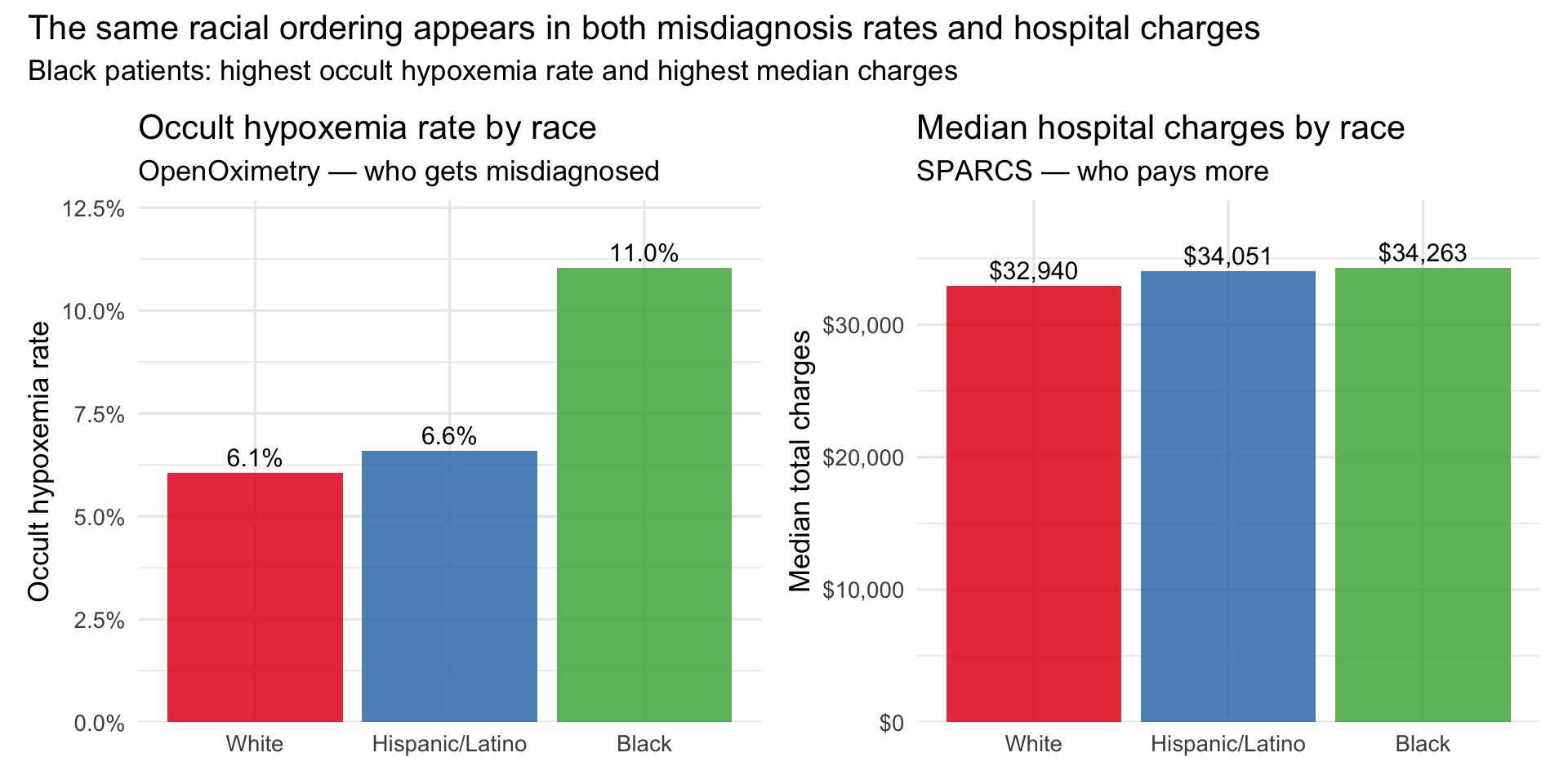
The bars above place the two datasets in direct conversation. The
ordering on the left — White lowest, Hispanic/Latino moderate, Black
highest — is the occult hypoxemia gradient from OpenOximetry. The
ordering on the right is the median charge gradient from SPARCS. They
are not identical, which is expected: these are different populations
measured in different settings. But the direction is consistent, and
that directional consistency is the ecological evidence the bridge is
designed to test. The double burden plot below adds the insurance
dimension to the same picture.
### The Double Burden
```{r}
#| label: double-burden
#| fig-alt: "Scatter of occult hypoxemia rate vs pct Medicaid or Self-Pay by race"
bridge |>
  ggplot(aes(x = occult_hypoxemia_rate, y = pct_unprotected,
             size = median_charges, label = race_eth)) +
  geom_point(alpha = 0.85, color = "#6a3d9a") +
  geom_text_repel(size = 4, fontface = "bold") +
  scale_x_continuous(labels = percent_format(accuracy = 0.1)) +
  scale_y_continuous(labels = percent_format(accuracy = 1)) +
  scale_size_continuous(labels = dollar_format(), range = c(4, 12)) +
  labs(
    title    = "The double burden: hidden hypoxemia risk and financial vulnerability",
    subtitle = "Groups most likely to be misdiagnosed are also least insured",
    x = "Occult hypoxemia rate (OpenOximetry)",
    y = "% on Medicaid or Self-Pay (SPARCS)",
    size = "Median charges"
  )
```
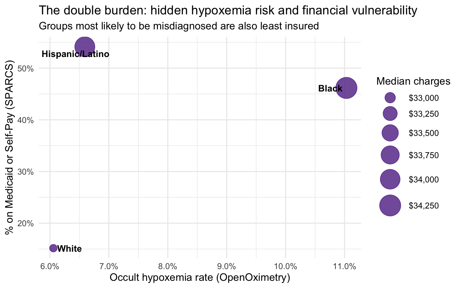
The group-level bridge is suggestive but not conclusive for one
important reason: White respiratory patients in SPARCS are substantially
older than Black and Hispanic/Latino patients, and older patients tend
to arrive sicker and stay longer regardless of any clinical bias. If age
is driving the severity and cost differences, the apparent disparity
could be mostly a demographic artifact. The age-stratified analysis
below addresses this directly by comparing racial groups within the same
age band, removing age as a confound.
### Age-Stratified Analysis
Age confounds the group-level comparison — White respiratory patients
skew older and are predominantly on Medicare. Stratifying by age band
enables a fair within-band comparison. The 103K-row SPARCS extract
provides stable cell counts (3,000–26,000 per race × age band).
```{r}
#| label: sparcs-age-summary
sparcs_age <- sparcs |>
  filter(!is.na(race_eth), !is.na(age_group)) |>
  group_by(race_eth, age_group) |>
  summarise(
    n_discharges   = n(),
    median_charges = median(total_charges,  na.rm = TRUE),
    median_costs   = median(total_costs,    na.rm = TRUE),
    median_los     = median(length_of_stay, na.rm = TRUE),
    mean_severity  = mean(severity_code,    na.rm = TRUE),
    mortality_rate = mean(died,             na.rm = TRUE),
    pct_medicaid   = mean(insurance == "Medicaid", na.rm = TRUE),
    .groups = "drop"
  )

sparcs_age |>
  mutate(
    median_charges = dollar(median_charges),
    median_los     = round(median_los, 1),
    mean_severity  = round(mean_severity, 2),
    mortality_rate = percent(mortality_rate, accuracy = 0.1),
    pct_medicaid   = percent(pct_medicaid,   accuracy = 0.1)
  ) |>
  arrange(age_group, race_eth) |>
  knitr::kable(
    col.names = c("Race", "Age group", "N", "Median charges", "Median costs",
                  "Median LOS", "Mean severity", "Mortality rate", "% Medicaid"),
    caption = "**Table 4. Age-stratified outcomes by race — full SPARCS respiratory extract**"
  )
```
Cell counts range from roughly 3,000 to 26,000 per race × age
combination — large enough that all estimates below are stable. The
18–49 band tests whether disparities exist before age-related
comorbidities accumulate. The 50–69 band is the cleanest
insurance-controlled comparison: old enough for respiratory conditions
to carry real clinical weight, young enough that most patients are not
yet on Medicare. The 70+ band is where both insurance and severity
converge — making any residual gap the hardest to explain away and the
most compelling evidence for a pre-admission clinical mechanism.
```{r}
#| label: charges-age-race
#| fig-alt: "Line plot of median charges by age group and race"
sparcs_age |>
  ggplot(aes(x = age_group, y = median_charges,
             color = race_eth, group = race_eth)) +
  geom_line(linewidth = 1.1) +
  geom_point(size = 3) +
  geom_text_repel(aes(label = dollar(median_charges, accuracy = 1)),
                  size = 3.2, show.legend = FALSE) +
  scale_y_continuous(labels = dollar_format()) +
  scale_color_brewer(palette = "Set1") +
  labs(
    title    = "Median charges by age group and race",
    subtitle = "Black and Hispanic/Latino patients are billed more at every age band",
    x = "Age group", y = "Median total charges", color = "Race / Ethnicity"
  )
```
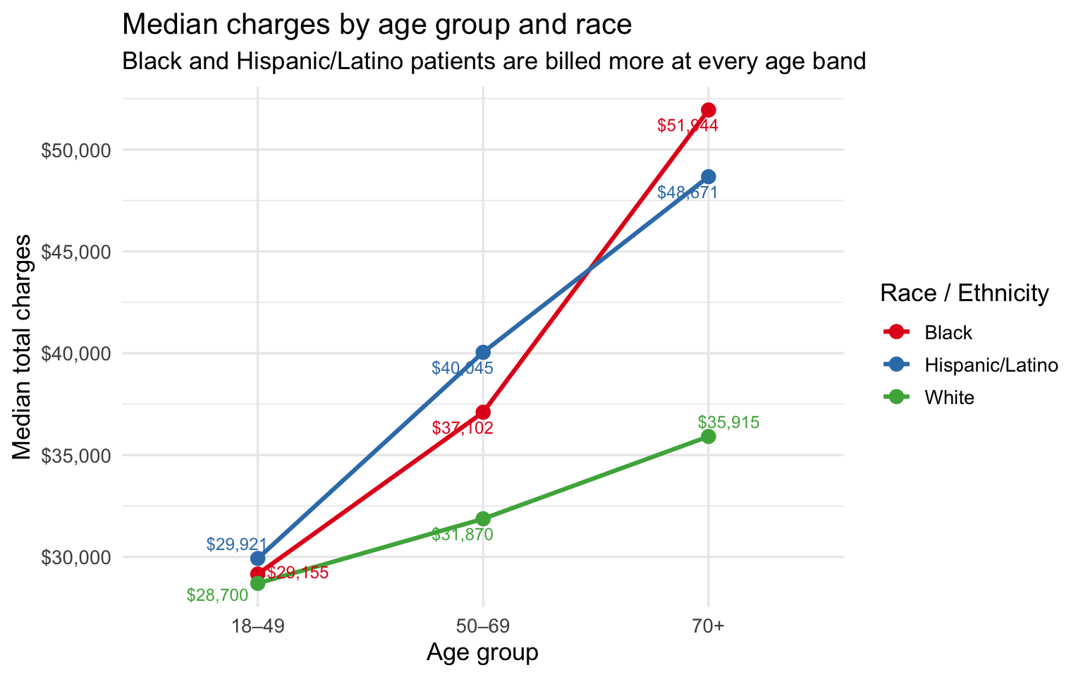
The charge gap is present at every age band and widens with age. At
18–49 the difference is small — under \$1,500 between any two groups. By
50–69 it has opened to roughly \$8K between Hispanic/Latino and White
patients. By 70+ Black patients are billed \~\$16K more and
Hispanic/Latino patients \~\$13K more than White patients at the same
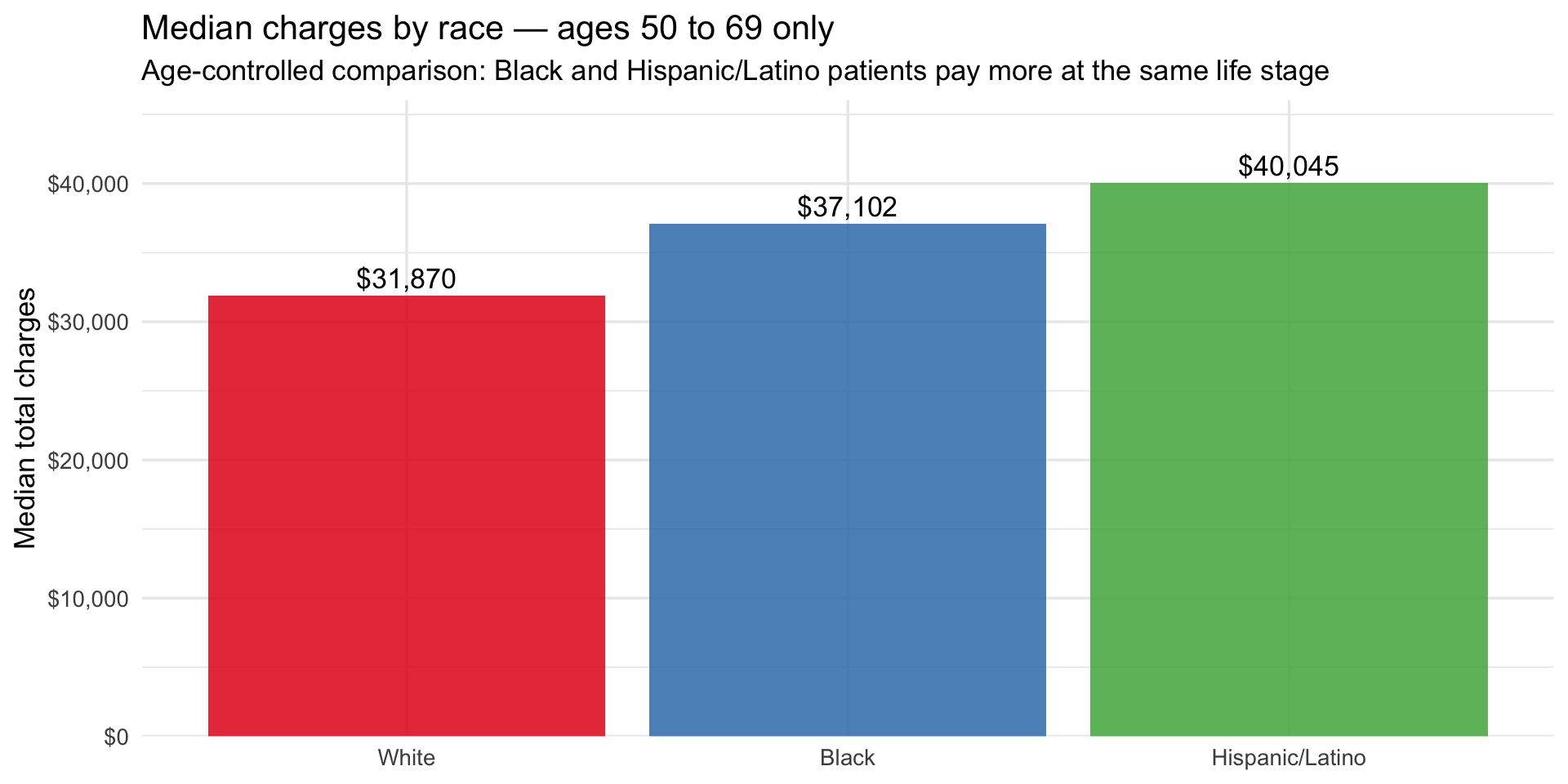
age. The bar chart below isolates the 50–69 band as the single cleanest
age-controlled comparison, where insurance mix still differs across
races but age no longer does.
```{r fig.width=10}
#| label: charges-severity-controlled
#| fig-alt: "Bar chart showing median charges by race at 50-69, the age-controlled comparison"
# 50–69 is the cleanest comparison: old enough to have respiratory comorbidities,
# young enough that most are not yet on Medicare — insurance mix is most comparable
sparcs_age |>
  filter(age_group == "50–69") |>
  mutate(race_eth = fct_reorder(race_eth, median_charges)) |>
  ggplot(aes(x = race_eth, y = median_charges, fill = race_eth)) +
  geom_col(alpha = 0.85, show.legend = FALSE) +
  geom_text(aes(label = dollar(median_charges, accuracy = 1)),
            vjust = -0.4, size = 4.5) +
  scale_y_continuous(labels = dollar_format(),
                     expand  = expansion(mult = c(0, 0.15))) +
  scale_fill_brewer(palette = "Set1") +
  labs(
    title    = "Median charges by race — ages 50 to 69 only",
    subtitle = "Age-controlled comparison: Black and Hispanic/Latino patients pay more at the same life stage",
    x = NULL, y = "Median total charges"
  )
```
Within the 50–69 band alone, Hispanic/Latino patients are billed \~\$8K
more than White patients and Black patients \~\$5K more, after removing
age as a variable. This is the most conservative framing of the
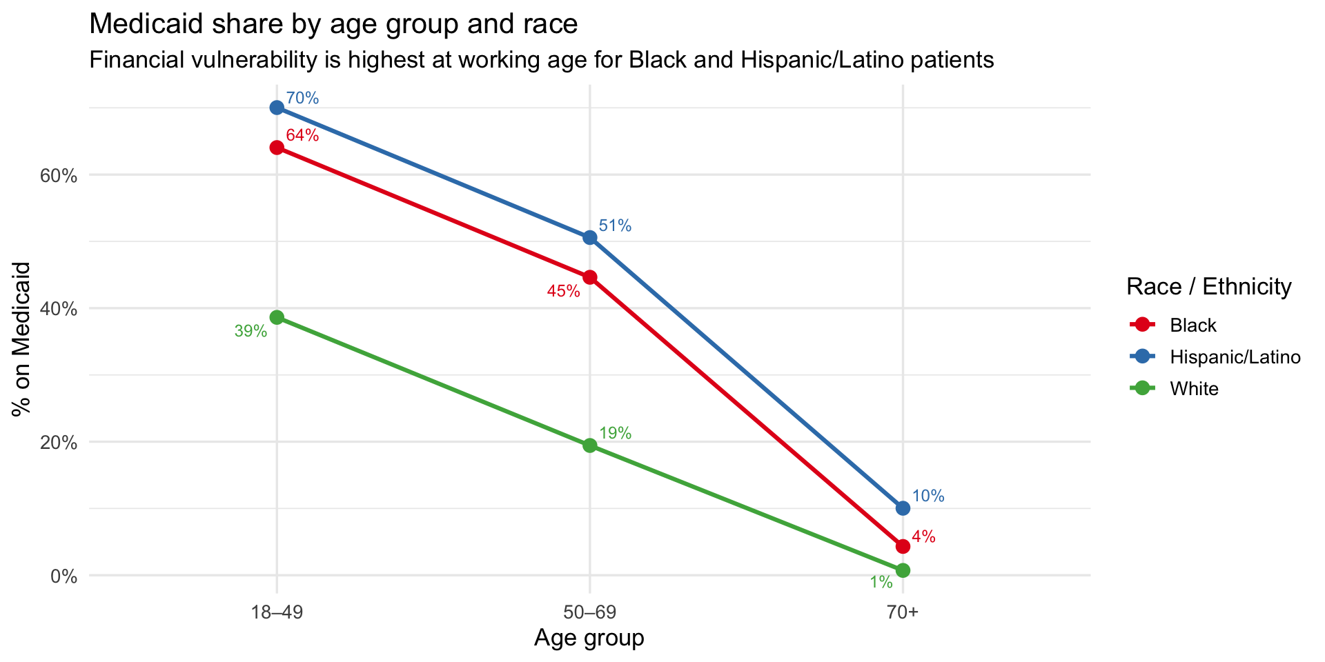
disparity — and it still shows a consistent gap. The Medicaid line plot
below adds the final piece by showing how financial vulnerability tracks
the same racial gradient across all three age bands, and what happens to
it at 70+ when Medicare takes over.
```{r fig.width=10}
#| label: medicaid-age-race
#| fig-alt: "Line plot of Medicaid share by age group and race"
sparcs_age |>
  ggplot(aes(x = age_group, y = pct_medicaid,
             color = race_eth, group = race_eth)) +
  geom_line(linewidth = 1.1) +
  geom_point(size = 3) +
  geom_text_repel(aes(label = percent(pct_medicaid, accuracy = 1)),
                  size = 3.2, show.legend = FALSE) +
  scale_y_continuous(labels = percent_format()) +
  scale_color_brewer(palette = "Set1") +
  labs(
    title    = "Medicaid share by age group and race",
    subtitle = "Financial vulnerability is highest at working age for Black and Hispanic/Latino patients",
    x = "Age group", y = "% on Medicaid", color = "Race / Ethnicity"
  )
```
**Key finding:** At 70+, two potential explanations for the charge gap
simultaneously collapse. First, Medicaid coverage converges to near zero
across all groups as patients shift to Medicare (Hispanic/Latino 10%,
Black 4%, White 1%) — so insurance can no longer explain the difference.
Second, severity scores converge tightly at 70+ (White 2.79, Black 2.78,
Hispanic/Latino 2.69) — so illness severity at admission cannot explain
it either. Yet Black patients are billed \~\$16K more than White
patients and Hispanic/Latino patients \~\$13K more, at the same age,
with the same insurance, at the same severity. The residual gap —
unexplained by age, insurance, or recorded severity — is consistent with
a clinical mechanism upstream of hospital admission, such as delayed
treatment from undetected hypoxemia inflating the true disease burden
beyond what severity scores capture at the point of care.
#### The 70+ finding: when insurance and severity converge, the charge gap remains
::: callout-important
**Key finding:** At 70+, two potential explanations for the charge gap
simultaneously collapse. First, Medicaid coverage converges to near zero
as patients shift to Medicare (Hispanic/Latino 10%, Black 4%, White 1%)
— so insurance can no longer explain the difference. Second, severity
scores converge tightly (White 2.79, Black 2.78, Hispanic/Latino 2.69) —
so illness severity at admission cannot explain it either. Yet Black
patients are billed \~\$16K more than White patients and Hispanic/Latino
patients \~\$13K more, at the same age, with the same insurance, at the
same severity. The residual gap — unexplained by age, insurance, or
recorded severity — is consistent with a clinical mechanism upstream of
hospital admission, such as delayed treatment from undetected hypoxemia
inflating the true disease burden beyond what severity scores capture at
the point of care.
:::
## Interactive Tool: Provider Bias Correction Dashboard
The Shiny dashboard is available embedded in the [Shiny
App](appx/app.qmd) section of this site and live at
[shinyapps.io](https://1wrn0x-liam-acosta0lora.shinyapps.io/project-healthcare-william-patricia-nayla/).
It has four tabs: a clinical visualization dashboard, an economic burden
explorer, a provider correction tool, and a data table. This section
documents the statistical methodology behind the correction tool
specifically, since it goes beyond data visualization into applied
estimation.
### What the Provider Tool Does
A clinician enters four inputs: the pulse oximeter reading (SpO₂ %), the
patient's Fitzpatrick skin tone group (Light I–II, Medium III–IV, or
Dark V–VI), self-reported race/ethnicity, and assigned sex at birth. The
tool returns three outputs in real time: an estimated true arterial
oxygen saturation (SaO₂) with a 95% confidence interval, an occult
hypoxemia risk probability, and a color-coded clinical flag (MASKED,
MONITOR, or WITHIN RANGE).
### Statistical Model
The tool is an **empirical bias correction**, not a machine learning
model. It is grounded in the paired measurement structure of the
OpenOximetry dataset, where each row represents one pulse oximeter
reading matched to a simultaneous arterial blood gas draw from the same
patient at the same moment. The correction has three components.
**Component 1 — Point correction.** For each Fitzpatrick group, we
compute the mean bias $\bar{b}_k$ from all paired measurements in that
group, where bias is defined as SpO₂ − SaO₂. A positive mean bias means
the device systematically overestimates. The corrected SaO₂ estimate is:
$$\hat{\text{SaO}}_2 = \text{SpO}_2 - \bar{b}_k - \delta_{\text{sex}}$$
where $k \in \{\text{Light, Medium, Dark}\}$ and $\delta_{\text{sex}}$
is a sex adjustment term applied only to Black and Asian female patients
($\delta_{\text{sex}} = 0.32$ pp), derived from Patricia's
intersectional analysis showing those subgroups carry approximately 0.32
percentage points of additional bias beyond the skin tone group mean.
The empirical bias parameters are:
| Skin tone group | Mean bias $\bar{b}_k$ | SD of bias $s_k$ | Occult hypoxemia rate |
|------------------|------------------|------------------|------------------|
| Light (I–II) | +0.62 pp | 3.21 pp | 6.2% |
| Medium (III–IV) | +1.08 pp | 3.45 pp | 6.6% |
| Dark (V–VI) | +1.82 pp | 3.89 pp | 11.6% |
**Component 2 — Uncertainty interval.** The 95% confidence interval
around the corrected estimate uses a normal approximation of the bias
distribution:
$$\hat{\text{SaO}}_2 \pm 1.96 \cdot \frac{s_k}{\sqrt{n_{\text{ref}}}}$$
where $s_k$ is the within-group standard deviation of bias from
OpenOximetry and $n_{\text{ref}} = 30$ is a conservative reference
sample size representing a typical clinical encounter. This is an
approximation: it treats the group-level variance as a proxy for the
measurement uncertainty a clinician faces when relying on a single
device reading. The interval is deliberately wide — individual-level
bias can deviate substantially from the group mean, as shown by the
violin plots in the dashboard.
**Component 3 — Occult hypoxemia risk.** The risk displayed is the
empirical occult hypoxemia rate for the patient's skin tone group,
adjusted upward by a factor of 1.18 for Black and Asian female patients
based on the intersectional bias finding. It is not computed from the
SpO₂ value directly. It represents the background probability that a
device reading above 88% in that demographic group is concealing true
SaO₂ below 88%.
### Clinical Flags
Three flag levels are triggered based on where the corrected estimate
falls relative to clinical thresholds:
- **MASKED** — SpO₂ ≥ 88% but $\hat{\text{SaO}}_2$ \< 88%. The device
reading passes the standard treatment threshold but the corrected
estimate falls below it. The patient may be eligible for
supplemental oxygen that is not being triggered.
- **MONITOR** — SpO₂ ≥ 92% but $\hat{\text{SaO}}_2$ \< 92%. The
corrected estimate falls below a common secondary monitoring
threshold. Arterial blood gas confirmation is recommended.
- **WITHIN RANGE** — Both the device reading and the corrected
estimate are above key thresholds. Bias correction has been applied;
routine monitoring is appropriate.
### What This Tool Is and Is Not
The correction is based on **group-level statistics**, not an individual
patient model. The mean bias for Dark skin patients is +1.82 pp on
average, but the standard deviation of 3.89 pp means the actual bias for
any individual measurement can range from strongly negative to strongly
positive. The confidence interval reflects this uncertainty. The tool
should be interpreted as a clinical awareness aid — a prompt to consider
ABG confirmation — not as a replacement for direct measurement.
The sex adjustment is a fixed additive term derived from our analysis of
the OpenOximetry intersectional subgroups and should be treated as a
preliminary estimate. The correction does not adjust for device model,
peripheral perfusion, nail polish, or motion artifact, all of which are
known sources of additional error. The occult hypoxemia rates are
derived from a controlled laboratory population in San Francisco and may
not generalize perfectly to all clinical settings.
::: callout-important
**This tool is for clinical awareness only — not a diagnostic device.**
Estimates are based on population-level bias statistics from
OpenOximetry 1.1.1 (UCSF Hypoxia Lab). Individual patient physiology
varies. Arterial blood gas measurement remains the gold standard for
determining true oxygen saturation, and clinical judgment should always
prevail.
:::
### Why This Matters
The 88% treatment threshold is a binary clinical trigger. Patients above
it may be sent home or have oxygen therapy withheld; patients below it
become eligible for interventions. A device that systematically reads
1.82 pp high for patients with Dark skin tones shifts a meaningful
fraction of genuinely hypoxic patients above this threshold — hiding
their condition from the clinical decision that should catch it. The
provider tool makes this bias visible at the point of care, in real
time, for the specific patient in front of the clinician.
## Video Presentation and Slides
### Video
::: {#fig-video}
{{< video https://youtu.be/NLKsuO_sdbk >}}
Video Presentation
:::
### Slides
<iframe
src="https://docs.google.com/presentation/d/e/2PACX-1vTtyBlAm5x2-aImcRpH_QA1kfCmpNmo7hJderKtfiTpNMyVBMMrR1DAerh7WJhWdhBVLM91Fbsx0aq1/pubembed?start=true&loop=false&delayms=3000"
frameborder="0"
width="100%"
height="569"
allowfullscreen="true">
</iframe>
[Download the PDF slides](hypoxemia_presentation%20(1).pdf)
## Conclusions
Our three research questions asked whether pulse oximetry accuracy
varies by race and skin tone, whether that disparity has economic
consequences, and whether race and insurance intersect to compound the
burden. The answer to all three is yes, and the evidence chain is
consistent across multiple analyses.
The clinical disparity is real, measurable, and systematic. Pulse
oximeters overestimate oxygen saturation for darker-skinned patients,
and this overestimation directly translates into a higher rate of occult
hypoxemia — the specific failure mode that causes treatment to be
withheld. The bias is not driven by one faulty device model; it is
present across the majority of commercially available devices tested in
the OpenOximetry lab. It is also not uniform by sex: Black and Asian
women face higher rates of occult hypoxemia than their male
counterparts, suggesting that sex amplifies the racial disparity in ways
that simple single-variable analyses miss.
The economic consequences mirror the clinical disparity. The racial
ordering in occult hypoxemia rates from OpenOximetry — White lowest,
Hispanic/Latino moderate, Black highest — is the same ordering that
appears in hospital charges from SPARCS. This matching gradient across
two independent datasets from different cities is the ecological
evidence connecting the clinical failure to its economic downstream.
After controlling for age by stratifying into three age bands, the
charge gap persists and widens. At 70+, when both insurance and severity
scores nearly equalize across racial groups, the charge gap reaches its
maximum — ruling out both as primary explanations and pointing toward a
pre-admission clinical mechanism as the most plausible remaining
candidate.
The insurance stratification adds the final dimension. Black and
Hispanic/Latino patients face both elevated misdiagnosis risk and
dramatically lower insurance protection at working age. The groups most
likely to be misdiagnosed are also the groups least equipped to absorb
the financial consequences when that misdiagnosis leads to a longer,
more expensive hospitalization.
------------------------------------------------------------------------
## Limitations and Future Work
### Limitations
**Ecological association, not causal.** The bridge between OpenOximetry
and SPARCS is built at the group level across two independent
populations. Race-level summary statistics from a San Francisco Bay Area
laboratory sample are matched to race-level summaries from New York
State hospital discharges. Directional consistency is evidence, not
proof. A patient-linked dataset containing both oximetry measurements
and hospitalization records for the same individuals would be necessary
to estimate causal effects.
**Severity scores may themselves be biased.** APR severity is coded at
discharge from the patient record. If pulse oximeter bias causes delayed
treatment — allowing a condition to deteriorate further before
intervention — then the severity score documented at admission may
understate the true disease burden the patient carried into the
encounter. Controlling for severity in a regression may therefore
underestimate the disparity rather than remove confounding cleanly.
**SPARCS has no separable Asian category.** Asian patients are recorded
under "Other Race" in SPARCS with no way to identify them, limiting the
bridge to three racial groups. OpenOximetry includes Asian patients, but
they cannot be matched to an economic outcome group in SPARCS.
**New York State is not nationally representative.** SPARCS reflects the
state's dense urban hospital system, high Medicaid enrollment, and
specific demographic composition. Findings may not generalize to states
with different payer mixes or rural hospital landscapes.
**Device models are labeled numerically and not linked to manufacturer
names.** The heatmap shows that the bias gradient is consistent across
device models, but without knowing which models correspond to which
manufacturers, we cannot make device-specific recommendations.
### Future Work
The most important next step is a **formal regression analysis**
controlling for age, severity, insurance, and gender simultaneously —
producing residual race coefficients that cannot be attributed to any of
the observable confounders.
We also want to run the **intersectional analysis** specified in the
project proposal: race × gender × insurance interaction effects on
charges. Patricia's EDA shows that sex compounds the occult hypoxemia
disparity; the regression will test whether it also compounds the
economic disparity.
Geographically, SPARCS provides hospital county information that we have
not yet used. A **county-level analysis** would test whether disparities
are concentrated in specific regions of New York or distributed
statewide — a finding that would inform where targeted interventions
might be most effective.
On the OpenOximetry side, Monk skin tone scores are present for a subset
of patients but have substantial missingness. Where both Fitzpatrick and
Monk scores are available, we plan to test whether **Monk captures
additional variance** in bias and occult hypoxemia beyond Fitzpatrick
alone, since Monk was designed to better represent the full range of
human skin tones.
Finally, the project has regulatory implications that we have not yet
quantified. Current FDA guidance for pulse oximeter clearance does not
require validation across the full Fitzpatrick spectrum. A natural
extension of this work is to estimate **what calibration requirements
would be necessary** to bring occult hypoxemia rates for Dark skin tones
within a clinically acceptable range of those for Light skin tones, and
what that would mean for current device approvals.