Topic: What is the Grammar of Graphics in ggplot2 and how is it different from Base R?
The Confusion: Students often wonder why ggplot2 requires a “plus” sign and multiple functions just to make a simple scatter plot.
The Solution: Understanding that ggplot2 isn’t just a plotting function—it’s a formal grammar for data visualization.
FINDINGS: The Grammar Components
The Grammar of Graphics (GoG) breaks a plot into independent layers:
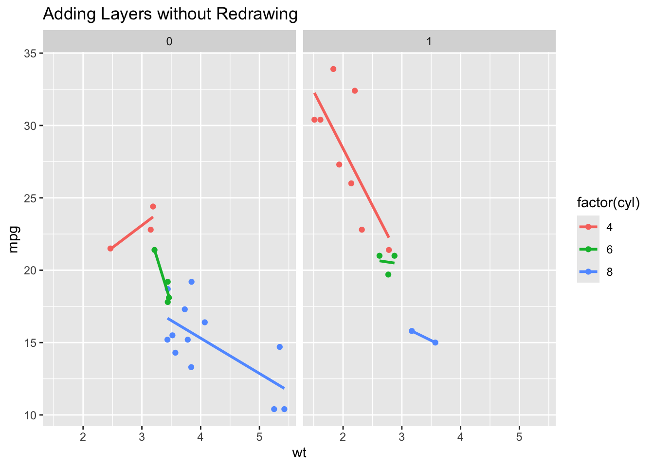
Data: The raw variables (the “Noun”). Aesthetics (aes): Mapping data to visual properties like x, y, or color (the “Adjectives”). Geoms: The actual marks (points, bars) on the screen (the “Verbs”). Facets: Splitting one plot into many based on a category.
Code
library(ggplot2)# Let's say we want to see this plot split by 'Day of the Week'# In ggplot2, we just add ONE component to our existing grammar:ggplot(mtcars, aes(x = wt, y = mpg, color =factor(cyl))) +geom_point() +geom_smooth(method ="lm", se =FALSE) +facet_wrap(~am) +labs(title ="Adding Layers without Redrawing")
CONCLUSION
The Grammar of Graphics explains why ggplot2 feels more structured.
Base R is like painting: if you want to change the background, you might have to paint over what you already did.
ggplot2 is like a deck of transparencies: you can swap the “Data” layer or the “Theme” layer without touching the “Geometry” layer.
EXTRA: THE “POWER OF THE GRAMMAR”
Code
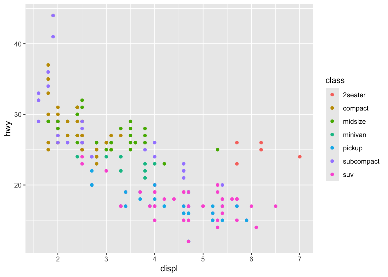
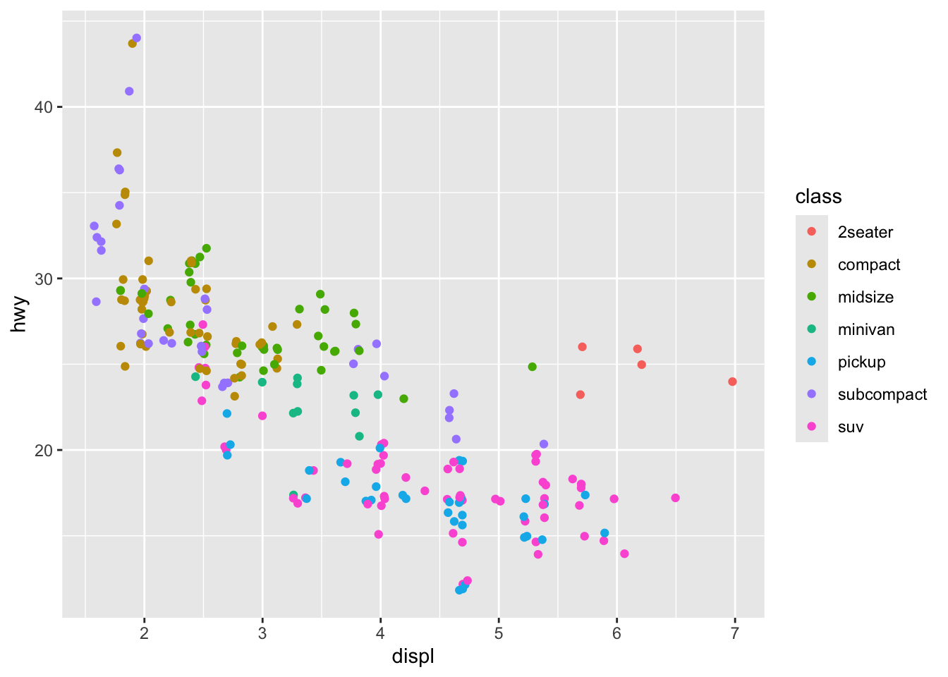
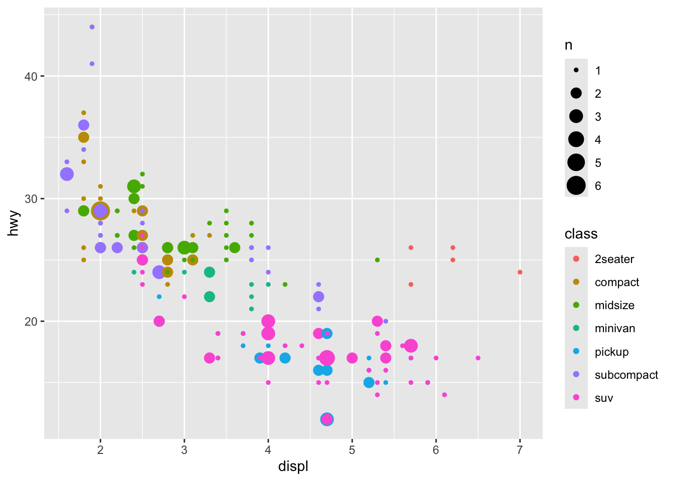
library(ggplot2)# 1. THE "OBJECT" ADVANTAGE# In Base R, a plot is just pixels on a screen. # In ggplot2, a plot is an OBJECT you can save and change later.p <-ggplot(mpg, aes(x = displ, y = hwy, color = class))p +geom_point() # Version A: Scatter
Code
p +geom_jitter() # Version B: Jittered (to see overlaps)
Code
p +geom_count() # Version C: Bubble chart
Code
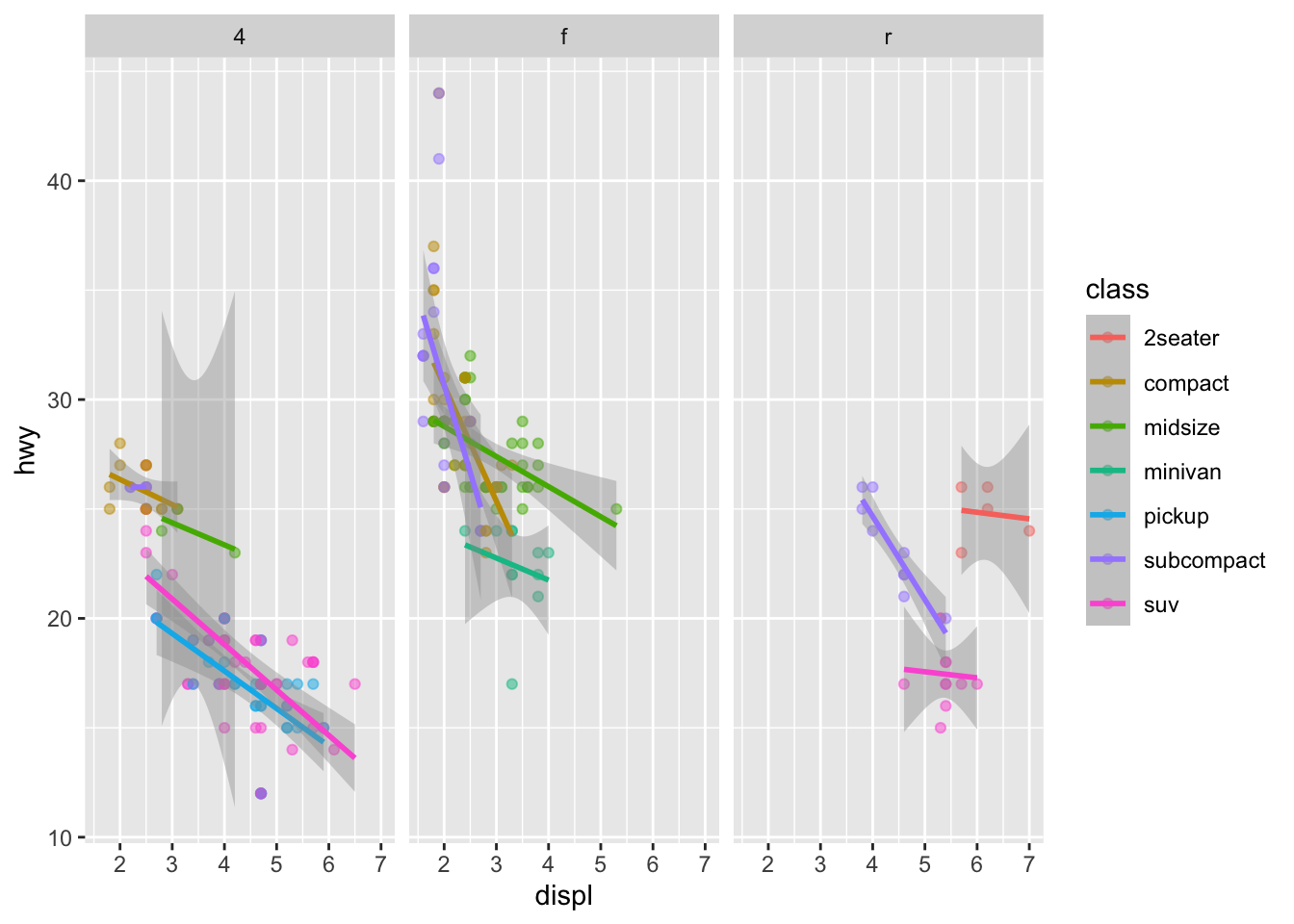
# 2. THE "STATISTICAL" LAYER # The Grammar includes "Stats." You don't have to calculate means or # regression lines yourself; you just add the layer.p +geom_point(alpha =0.5) +# Add points with transparencygeom_smooth(method ="lm") +# Add a linear model layerfacet_wrap(~drv) # Split by drive type (4wd, fwd, rwd)
Code
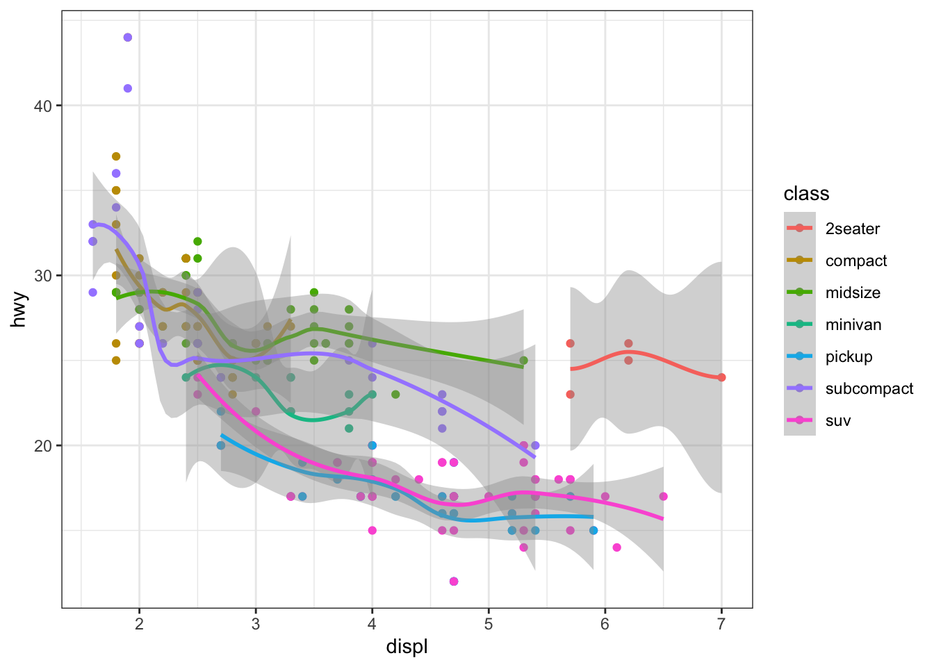
# 3. THE "THEME" LAYER (The Non-Data Ink) # Because the "Look" is a separate layer from the "Data," # you can change the entire aesthetic in one line.final_plot <- p +geom_point() +geom_smooth()final_plot +theme_bw() # Clean and professional
Code
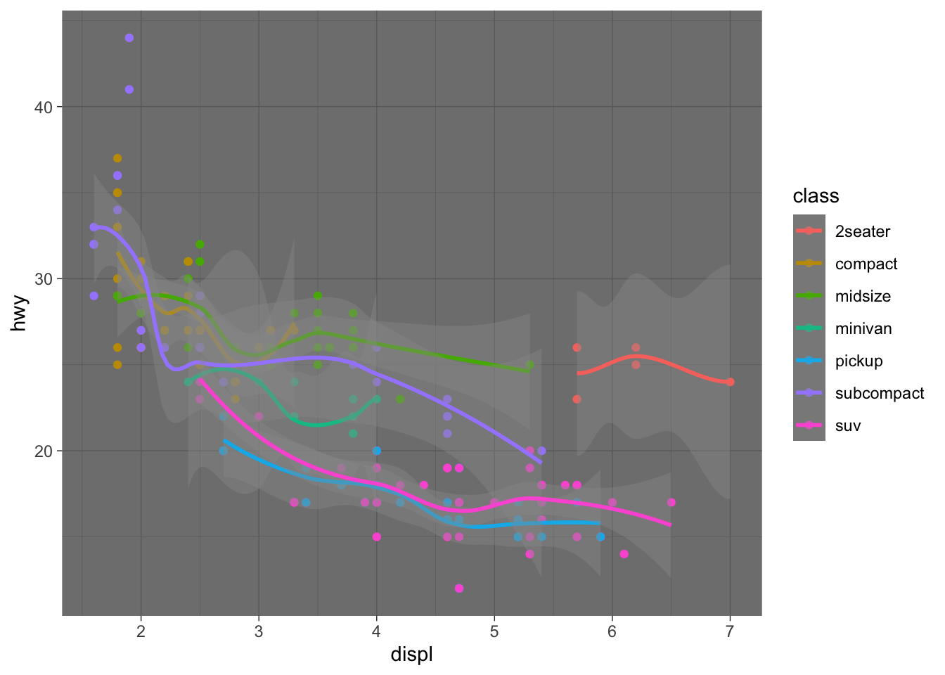
final_plot +theme_dark() # High contrast
Code
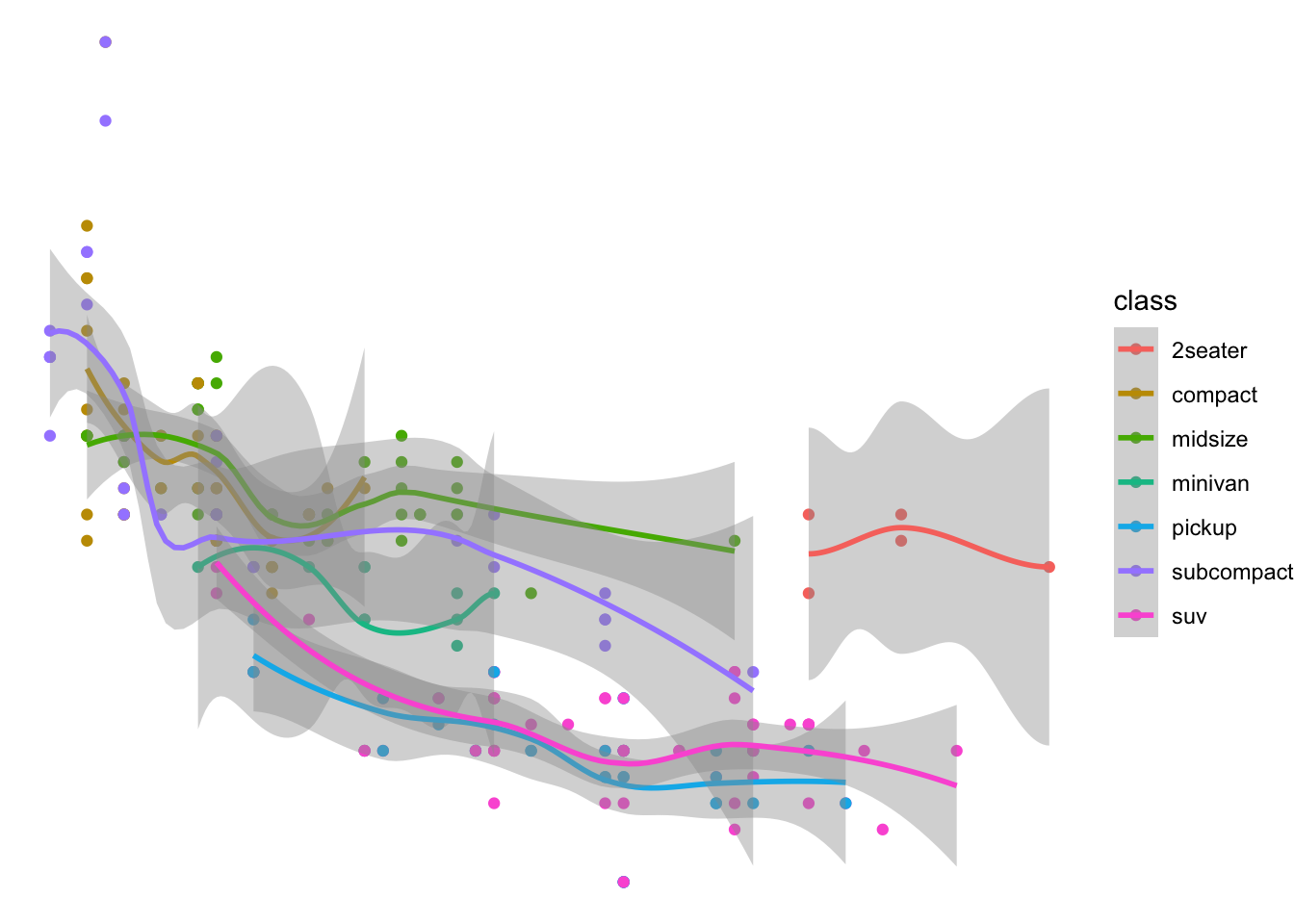
final_plot +theme_void() # Only the data, no axes!
Code
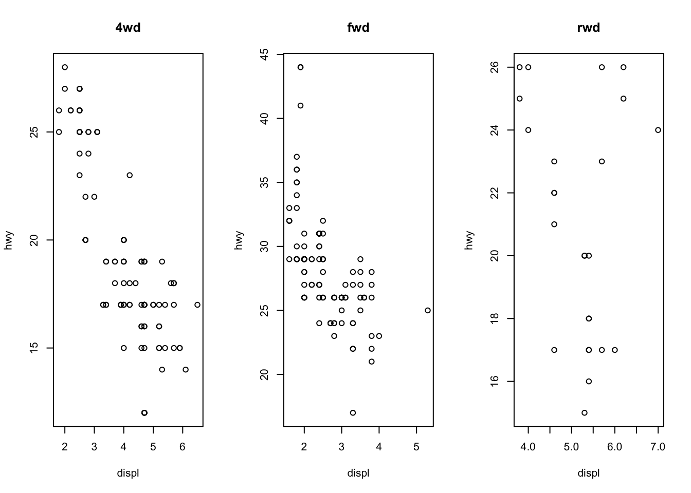
# 4. BASE R COMPARISON (The "Hard Way") # To do the "Faceting" from step 2 in Base R, you'd need something like this:par(mfrow =c(1, 3)) with(mpg[mpg$drv =="4", ], plot(displ, hwy, main="4wd"))with(mpg[mpg$drv =="f", ], plot(displ, hwy, main="fwd"))with(mpg[mpg$drv =="r", ], plot(displ, hwy, main="rwd"))
Source Code
---title: "Exam2"---## TOPIC & MOTIVATIONTopic: What is the Grammar of Graphics in ggplot2 and how is it different from Base R?The Confusion: Students often wonder why `ggplot2` requires a "plus" sign and multiple functions just to make a simple scatter plot. The Solution: Understanding that `ggplot2` isn't just a plotting function—it's a formal grammar for data visualization.## FINDINGS: The Grammar ComponentsThe Grammar of Graphics (GoG) breaks a plot into independent layers:Data: The raw variables (the "Noun").Aesthetics (aes): Mapping data to visual properties like x, y, or color (the "Adjectives").Geoms: The actual marks (points, bars) on the screen (the "Verbs").Facets: Splitting one plot into many based on a category.```{r}library(ggplot2)# Let's say we want to see this plot split by 'Day of the Week'# In ggplot2, we just add ONE component to our existing grammar:ggplot(mtcars, aes(x = wt, y = mpg, color =factor(cyl))) +geom_point() +geom_smooth(method ="lm", se =FALSE) +facet_wrap(~am) +labs(title ="Adding Layers without Redrawing")```## CONCLUSIONThe Grammar of Graphics explains why ggplot2 feels more structured.Base R is like painting: if you want to change the background, you might have to paint over what you already did.ggplot2 is like a deck of transparencies: you can swap the "Data" layer or the "Theme" layer without touching the "Geometry" layer.## EXTRA: THE "POWER OF THE GRAMMAR"```{r}library(ggplot2)# 1. THE "OBJECT" ADVANTAGE# In Base R, a plot is just pixels on a screen. # In ggplot2, a plot is an OBJECT you can save and change later.p <-ggplot(mpg, aes(x = displ, y = hwy, color = class))p +geom_point() # Version A: Scatterp +geom_jitter() # Version B: Jittered (to see overlaps)p +geom_count() # Version C: Bubble chart# 2. THE "STATISTICAL" LAYER # The Grammar includes "Stats." You don't have to calculate means or # regression lines yourself; you just add the layer.p +geom_point(alpha =0.5) +# Add points with transparencygeom_smooth(method ="lm") +# Add a linear model layerfacet_wrap(~drv) # Split by drive type (4wd, fwd, rwd)# 3. THE "THEME" LAYER (The Non-Data Ink) # Because the "Look" is a separate layer from the "Data," # you can change the entire aesthetic in one line.final_plot <- p +geom_point() +geom_smooth()final_plot +theme_bw() # Clean and professionalfinal_plot +theme_dark() # High contrastfinal_plot +theme_void() # Only the data, no axes!# 4. BASE R COMPARISON (The "Hard Way") # To do the "Faceting" from step 2 in Base R, you'd need something like this:par(mfrow =c(1, 3)) with(mpg[mpg$drv =="4", ], plot(displ, hwy, main="4wd"))with(mpg[mpg$drv =="f", ], plot(displ, hwy, main="fwd"))with(mpg[mpg$drv =="r", ], plot(displ, hwy, main="rwd"))```